This post compares the implementation of a simple ListBox layout with Windows Forms and Windows Presentation Foundation. The use of Templates within WPF are a clear winner over the WinForms 'owner draw' route.
Application user interfaces are becoming much more graphical, with users expecting a more engaging and 'lively' experience. However, rich graphical UIs can do much more for the user than just provide an experience that looks and feels good. Graphics can be used to more effectively convey the options available to the user. For example, which of these line weight selectors would assist best in helping a a user determine a suitable selection ...

I think most users would prefer the second option where they can visualise a range of line weights and actually see how they look (after all, how many users know what a 'pt' actually is?) before making a selection. However, for a Windows Forms developer, the first option, a simple text box with the label 'pt' next to it, is trivial to implement, whereas the second is not.
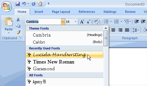
Applications such as Word 2007 present as many of the user options as possible in a visual style, for example, the font selector in previous versions of Word simply presented a list of font names, whereas in Word 2007 each font is rendered as it would appear to the user. Furthermore, the font selector combo-box is grouped to include recently used fonts:

Unfortunately for the developer, creating visual UIs can be quite challenging.
Windows Forms has been the technology of choice for the creation of business desktop applications for a number of years. The developer is presented with a large number of standard controls with which they can build their application, however these controls lack the flexibility required to create a more visual interface. For example, combo-boxes and list-boxes are designed to render text content, not mixed font text with icons, or lines of varying weight as seen in our above examples. To create a control that renders non-standard content, the only route available to the developer is 'owner draw' where the developer handles events in order to render all or part of the control. This is a time consuming and highly iterative process, with the developer having to compile and run their code repeatedly to see the results of their graphics code.
One of the key differences between Windows Forms and WPF is the way in which the visual representation of controls and their content is encoded. WPF has the concept of templates, an XML (or more accurately XAML) representation of how a control is rendered to the screen. This is what allows WPF developers / designers to create funky looking round buttons and other impressive UI fluff! However, probably of more interest to developers of business applications are data templates, which detail how data is represented on the screen.
Controls such as list-boxes and combo-boxes are used to represent, and provide selection from, a list of data objects. With the WPF framework, the way in which this data is represented is specified by a DataTemplate. We'll take a look at how this differs from the WinForms owner-draw route by rendering the same content with each technology.
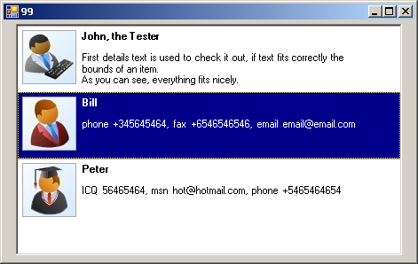
There are quite a few articles available on the internet which describe how to create an owner draw listbox. I took the sourcecode from an article on codeproject by GiedriusBan, his article describes how to owner-draw a listbox to add some more complex content into each item:

Because the listbox is being used to render more than just text, the only viable solution is to 'owner draw' each listbox item, this is done by handling an event provided by the listbox and the following GDI graphics code:
public void drawItem(DrawItemEventArgs e, Padding margin,
                        Font titleFont, Font detailsFont, StringFormat aligment,
                        Size imageSize)
{
    bool isHighlighted = (e.State & DrawItemState.Selected) == DrawItemState.Selected;

    // if selected, mark the background differently
    e.Graphics.FillRectangle(isHighlighted ? Brushes.DarkBlue : Brushes.White, e.Bounds);


    // draw some item separator
    e.Graphics.DrawLine(Pens.DarkGray, e.Bounds.X, e.Bounds.Y,
                               e.Bounds.X + e.Bounds.Width, e.Bounds.Y);

    // draw item image
    e.Graphics.DrawImage(this.ItemImage, e.Bounds.X + margin.Left,
                                  e.Bounds.Y + margin.Top, imageSize.Width, imageSize.Height);

    // draw a border around the image
    e.Graphics.DrawRectangle(Pens.DarkGray, e.Bounds.X + margin.Left, e.Bounds.Y + margin.Top,
                                       imageSize.Width, imageSize.Height);

    // calculate bounds for title text drawing
    Rectangle titleBounds = new Rectangle(e.Bounds.X + margin.Horizontal + imageSize.Width,
                  e.Bounds.Y + margin.Top,
                  e.Bounds.Width - margin.Right - imageSize.Width - margin.Horizontal,
                  (int)titleFont.GetHeight() + 2);

    // calculate bounds for details text drawing
    Rectangle detailBounds = new Rectangle(e.Bounds.X + margin.Horizontal + imageSize.Width,
                    e.Bounds.Y + (int)titleFont.GetHeight() + 2 + margin.Vertical + margin.Top,
                    e.Bounds.Width - margin.Right - imageSize.Width - margin.Horizontal,
                    e.Bounds.Height - margin.Bottom - (int)titleFont.GetHeight() - 2 - margin.Vertical - margin.Top);

    // draw the text within the bounds
    var brush = isHighlighted ? Brushes.White : Brushes.Black;
    e.Graphics.DrawString(this.Title, titleFont, brush, titleBounds, aligment);
    e.Graphics.DrawString(this.Details, detailsFont, brush, detailBounds, aligment);

    // put some focus rectangle
    e.DrawFocusRectangle();

}
This is a lot of 'heavy' and hard to follow graphics code to achieve such a simple listbox item layout!
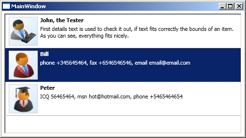
With WPF the listbox uses a template to render the data within the list. Here is the same list rendered with a WPF application:

And here is the XAML code to create this layout:
<ListBox Margin="5" ItemsSource="{Binding}"
            ItemContainerStyle="{StaticResource StretchedContainerStyle}">
    <ListBox.ItemTemplate>
        <DataTemplate>
            <Grid HorizontalAlignment="Stretch">
                <Grid Margin="5">
                    <Grid.ColumnDefinitions>
                        <ColumnDefinition Width="Auto"/>
                        <ColumnDefinition/>
                    </Grid.ColumnDefinitions>
                    <Grid.RowDefinitions>
                        <RowDefinition Height="Auto"/>
                        <RowDefinition/>
                    </Grid.RowDefinitions>

                    <Border  Grid.RowSpan="2"
                                BorderBrush="LightGray" BorderThickness="1"
                                Margin="0,0,5,0">
                        <Image Source="{Binding Image}"/>
                    </Border>
                    <TextBlock Text="{Binding Name}"
                                FontWeight="Bold"
                                Grid.Column="2"
                                Margin="0,0,0,5"/>
                    <TextBlock Text="{Binding Details}"
                                Grid.Column="2" Grid.Row="2"/>
                </Grid>
                <Line X1="0" Y1="0" X2="1" Y2="0" Stretch="Uniform"
                        Stroke="DarkGray"
                        VerticalAlignment="Bottom"/>
            </Grid>
        </DataTemplate>
    </ListBox.ItemTemplate>
</ListBox>
Comparing the two approaches; not only is there less code in the WPF version, it is also much clearer and easy to follow. However, the advantages of the WPF approach do not end there ...
WPF uses a retained graphics mode, which means the various elements in the above XAML code are assembled into a visual tree that is retained in memory, rather than just being painted to some bitmap. This means that the developer does not have to worry about invalidation, and does not need to employ techniques to avoid flicker when re-drawing.
The original author of the WinForms code above subclassed ListBox and created a concrete control for rendering this specific data with this specific layout. With WPF there is no subclassing, and no need to create a specific ListBoxItem for each row to provide the data for the control, instead the list binds directly to the business objects, with the DataTemplate doing all the work.
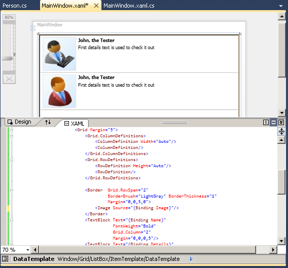
Finally, you can supply design time data to your WPF / Silverlight applications, allowing you to get immediate feedback when designing your templates, removing the time consuming build / execution cycle required with WinForms. The screenshot below shows how the listbox looks in visual studio:

And here is the design time data:
<PersonCollection xmlns="clr-namespace:TemplatedListBox">
    <Person Name="John, the Tester"
            Details="First details text is used to check it out"
            Image="image1.jpg"/>
    <Person Name="John, the Tester"
                Details="First details text is used to check it out"
                Image="image2.jpg"/>
</PersonCollection>
In conclusion, templates are a very powerful features of the WPF (and Silverlight) framework that provide far more that just a mechanism for creating round buttons! If we look at the font selector used in Word 2007, I can imagine creating this UI with WPF in a matter of hours, whereas with WinForms it would take days. That is why I love WPF!
You can download the WPF and WinForms source for this article: WPFLove.zip
Regards, Colin E.
