This blog post presents a Windows Phone 7 Jump List control that I have developed.This post describes the API in detail and includes full sourcecode. Feel free to use and enjoy!
The video below shows the control working on the emulator, the video further down this page shows it working on a real device. Full sourcecode is linked at the end of this article.
Introduction
For Silverlight developers Windows Phone 7 is a dream come true, a mobile platform that supports a language / framework they already know, or as Jesse Liberty puts it, "You are already a Windows Phone Developer". What I find really cool about Silverlight for WP7 is that exactly the same controls can be used both on the web and the mobile. However, the controls for Windows Phone 7 are tailored specifically for the mobile form factor having larger areas to 'hit', and gestures for scrolling for example. Despite this, there are times when you really need a control that is specific to the mobile platform.
Navigating long lists of data is a chore on a mobile device. On the desktop / web you can click on the scrollbar and navigate the full length of the list with a single gesture, whereas navigating the same list on a mobile requires multiple swipe gestures. This is where a Jump List comes in handy!
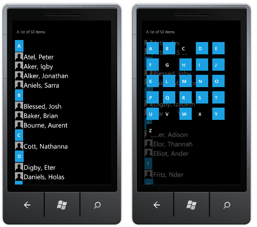
A Jump List groups the items within the long list into categories. Clicking on a category heading (or jump button) opens up a category view, where you can then click on one of the other categories immediately causing the list to scroll to the start of this newly selected category.
This blog post describes the API of the Jump List control I have developed. A link to the full sourcecode and a demo application can be found at the end of this blog post.
The video below shows the JumpList working (and performing well!) on a Samsung Omnia WP7. Apologies for the poor video quality!
Basic Example
The API for the JumpList is quite similar to that of the ListBox, it has an ItemsSource property which you set (or bind) the collection of objects you wish to render in the list. The appearance of each item is specified by an ItemTemplate. The example below shows a JumpList bound to a collection of simple Person objects:
public class Person
{
  public string Surname { get; set; }
  public string Forename { get; set; }
}

// ItemsSource set in constructor of control ....
list.ItemsSource = PersonDataSource.CreateList(50);
(As an aside, the PersonDataSource above generates pseudo-random names using Markov Chains using some code I found online)
<l:JumpList x:Name="list"
            ScrollDuration="400">

  <!-- category provider - details how the items are grouped -->
  <l:JumpList.CategoryProvider>
    <l:AlphabetCategoryProvider PropertyName="Surname"/>
  </l:JumpList.CategoryProvider>

  <!-- item template - details how each item is rendered in the list -->
  <l:JumpList.ItemTemplate>
    <DataTemplate>
      <StackPanel Orientation="Horizontal"
                  Margin="0,3,0,3"
                  Height="40">
        <Image Source="Head.png"
                Opacity="0.7"
                Width="40" Height="40"/>
        <TextBlock Text="{Binding Surname}"
                    Margin="3,0,0,0"/>
        <TextBlock Text=", "/>
        <TextBlock Text="{Binding Forename}"/>
      </StackPanel>
    </DataTemplate>
  </l:JumpList.ItemTemplate>

</l:JumpList>
The main difference between the JumpList and a ListBox is that a JumpList requires that you supply a CategoryProvider. In the example above an AlphabetCategoryProvider was supplied which groups the supplied objects (in this case Person instances) based on the first letter of the property indicated by the PropertyName of the AlphabetCategoryProvider. In this example, the items are being grouped by the Surname property.
The animated scrolling as the list jumps from one category to the next can be controlled via the ScrollDuration property. The animated 'reveal' effect as the category buttons are drawn can be controlled via the CategoryTileAnimationDelay property which details the time between the animation being started for neighbouring category buttons.
Note, for very long lists with hundreds of items it makes sense to disable the scrolling effect as the list 'jumps' to the selected category.
The jump buttons that appear at the top of each group can be configured via properties that specify their style, template and item template. You can consult the API for more details. The category buttons which are rendered in the category view also have three similar properties. For example, you can use the JumpButtonStyle to make each button the same size, or the CategoryButtonStyle to create larger category buttons.
Selection
The JumpList exposes a SelectedItem property which can be used to get or set the currently selected item. This property also permits TwoWay binding to other controls or a View Model. The JumpList also exposes a SelectionChanged event which is fired whenever the SelectedItem property changed, this event is useful for more programmatic / non-databound usages.
The following code snippet shows a simple UI binding of the JumpList SelectedItem:
<StackPanel DataContext="{Binding Path=SelectedItem, ElementName=list}">
  <TextBlock Text="SELECTED ITEM:"/>
  <!-- displays the Name property of the object bound to the JumpList -->
  <TextBlock Text="{Binding Name}"/>
</StackPanel>

<l:JumpList x:Name="list">
  <!-- ItemTemplate etc ... -->
</l:JumpList>
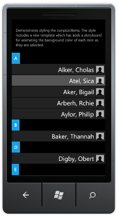
Each item within the JumpList is contained within a JumpListItem. When an item is selected, the default JumpList item template changes the Foreground colour to PhoneAccentBrush. It is possible to style and template the JumpListItems via the JumpListItemStyle property. The following example adds a Border element and sets the Background colour of this Border when an item is selected:
<l:JumpList.JumpListItemStyle>
  <Style TargetType="l:JumpListItem">
    <Setter Property="BorderThickness" Value="1"/>
    <Setter Property="Background" Value="#222"/>
    <Setter Property="Padding" Value="2"/>
    <Setter Property="Margin" Value="0"/>
    <Setter Property="HorizontalContentAlignment" Value="Right"/>
    <Setter Property="Template">
      <Setter.Value>
        <ControlTemplate TargetType="l:JumpListItem">
          <Border x:Name="LayoutRoot"
                  Background="{TemplateBinding Background}"
                  HorizontalAlignment="{TemplateBinding HorizontalAlignment}"
                  VerticalAlignment="{TemplateBinding VerticalAlignment}"
                  BorderBrush="{TemplateBinding BorderBrush}"
                  BorderThickness="{TemplateBinding BorderThickness}">
            <VisualStateManager.VisualStateGroups>
              <VisualStateGroup x:Name="CommonStates">
                <VisualState x:Name="Normal"/>
                <VisualState x:Name="MouseOver" />
                <VisualState x:Name="Disabled"/>
              </VisualStateGroup>
              <VisualStateGroup x:Name="SelectionStates">
                <VisualState x:Name="Unselected"/>
                <VisualState x:Name="Selected">
                  <Storyboard>
                    <!-- change the background on selection -->
                    <ColorAnimation
                        Storyboard.TargetName="LayoutRoot"
                        Storyboard.TargetProperty="(Border.Background).(SolidColorBrush.Color)"
                        To="#555"
                        Duration="0:0:0.5">
                    </ColorAnimation>
                  </Storyboard>
                </VisualState>
              </VisualStateGroup>
            </VisualStateManager.VisualStateGroups>

            <ContentControl x:Name="ContentContainer"
                      VerticalContentAlignment="{TemplateBinding VerticalContentAlignment}"
                      HorizontalContentAlignment="{TemplateBinding HorizontalContentAlignment}"
                      Margin="{TemplateBinding Padding}"
                      Content="{TemplateBinding Content}"
                      ContentTemplate="{TemplateBinding ContentTemplate}"
                      Foreground="{TemplateBinding Foreground}" />
          </Border>
        </ControlTemplate>
      </Setter.Value>
    </Setter>
  </Style>
</l:JumpList.JumpListItemStyle>
The Category Provider
As seen in the earlier example, the JumpList uses a category provider, specified via the JumpList.CategoryProvider property to place items into categories within the jump list. The CategoryProvider implements the following interface:
/// <summary>
/// A category provider assigns items to categories and details
/// the full category list for a set of items.
/// </summary>
public interface ICategoryProvider
{
  /// <summary>
  /// Gets the category for the given items
  /// </summary>
  object GetCategoryForItem(object item);

  /// <summary>
  /// Gets the full list of categories for the given items.
  /// </summary>
  List<object> GetCategoryList(IEnumerable items);
}
The GetCategoryForItem method is used to determine the category for each item in the list, whilst GetCategoryList returns the full list of categories in order to display the category view.
The JumpList comes with a couple of 'built in' category providers:
The AlphabetCategoryProvider uses the first letter of a named property to identify the category for each item. The category list which AlphabetCategoryProvider provides is always the full alphabet. The category view 'grays' category buttons for which the source list has no items.
The DistinctPropertyValueCategoryProvider is a slightly more generic provider, placing items into categories based on the value of the property nominated via PropertyName. With this provider the category list displays all the unique or distinct values found for the given property.
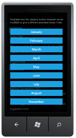
For example, if you have a list of events which you want to group by month, you can use a DistinctPropertyValueCategoryProvider identifying a property on your object which indicates the month. For example:
public class JugglingEvent
{
  public string Name { get; set; }
  public DateTime Date { get; set; }
  public string Description { get; set; }

  public int Month
  {
    get
    {
      return Date.Month;
    }
  }
}
The category provider is detailed as follows:
<!-- category provider groups by month-->
<l:JumpList.CategoryProvider>
  <l:DistinctPropertyValueCategoryProvider
        PropertyName="Month"/>
</l:JumpList.CategoryProvider>
This will group the items by month. However, the Month property exposes an integer, and this will be supplied as the DataContext for the jump buttons and category buttons. In order to display the month indices as their respective strings, a value converter can be supplied to the jump button and category button item templates:
<!-- the jump button template renders the month as a string -->
<l:JumpList.JumpButtonItemTemplate>
  <DataTemplate>
    <TextBlock Text="{Binding Path=., Converter={StaticResource MonthIndexToStringConverter}}"/>
  </DataTemplate>
</l:JumpList.JumpButtonItemTemplate>

<!-- the category template renders the month as a string -->
<l:JumpList.CategoryButtonItemTemplate>
  <DataTemplate>
    <TextBlock Text="{Binding Path=., Converter={StaticResource MonthIndexToStringConverter}}"/>
  </DataTemplate>
</l:JumpList.CategoryButtonItemTemplate>
Custom Category Button Animations
When the category view is displayed, each category button is revealed via a storyboard. These storyboards are started sequentially with a delay, specified by the CategoryTileAnimationDelay property, between the start of neighbouring buttons.
The storyboards that define the animation are within the template of the category buttons. The JumpList control looks for two storyboards, name "ShowAnim" and "HideAnim", and triggers these to show / hide the button respectively.
If you want to disable animations altogether, you can omit these storyboards. You can also specify your a custom animation by inserting your own storyboards into the category button template.
The example below adds a custom animation which reveals each button by rotating it around its centre:
<!-- create a custom category button animation -->
<l:JumpList.CategoryButtonTemplate>
  <ControlTemplate TargetType="Button">
    <Grid Background="Transparent"
        x:Name="Parent"
        RenderTransformOrigin="0.5,0.5">
      <Grid.Resources>
        <Storyboard x:Key="ShowAnim">
          <DoubleAnimation To="0" Duration="0:0:0.3"
                            Storyboard.TargetName="Parent"
                            Storyboard.TargetProperty="(Grid.Projection).(PlaneProjection.RotationX)"/>
        </Storyboard>
        <Storyboard x:Key="HideAnim">
          <DoubleAnimation To="90" Duration="0:0:0.1"
                            Storyboard.TargetName="Parent"
                            Storyboard.TargetProperty="(Grid.Projection).(PlaneProjection.RotationX)"/>
        </Storyboard>
      </Grid.Resources>
      <Grid.Projection>
        <PlaneProjection RotationX="90"/>
      </Grid.Projection>

      <VisualStateManager.VisualStateGroups>
        <VisualStateGroup x:Name="CommonStates">
          <VisualState x:Name="Normal"/>
          <VisualState x:Name="MouseOver"/>
          <VisualState x:Name="Pressed">
            <Storyboard>
              <ColorAnimation To="White" Duration="0:0:0"
                            Storyboard.TargetName="Background"
                            Storyboard.TargetProperty="(Rectangle.Fill).(SolidColorBrush.Color)"/>
            </Storyboard>
          </VisualState>
          <VisualState x:Name="Disabled">
            <Storyboard>
              <DoubleAnimation To="1" Duration="0:0:0"
                            Storyboard.TargetName="DisabledBackground"
                            Storyboard.TargetProperty="(Rectangle.Opacity)"/>
              <DoubleAnimation To="0" Duration="0:0:0"
                            Storyboard.TargetName="Background"
                            Storyboard.TargetProperty="(Rectangle.Opacity)"/>
            </Storyboard>
          </VisualState>
        </VisualStateGroup>
      </VisualStateManager.VisualStateGroups>
      <Rectangle  x:Name="Background"
                      Fill="{StaticResource PhoneAccentBrush}"/>
      <Rectangle  x:Name="DisabledBackground"
                      Fill="{StaticResource PhoneBackgroundBrush}"
                      Opacity="0"/>
      <ContentControl x:Name="ContentContainer"
                    Foreground="{TemplateBinding Foreground}"
                    HorizontalContentAlignment="{TemplateBinding HorizontalContentAlignment}"
                    VerticalContentAlignment="{TemplateBinding VerticalContentAlignment}"
                    Padding="{TemplateBinding Padding}"
                    Content="{TemplateBinding Content}"
                    ContentTemplate="{TemplateBinding ContentTemplate}"/>
    </Grid>
  </ControlTemplate>
</l:JumpList.CategoryButtonTemplate>
If you have many categories, and want to disable the 'reveal' animation, simply supply a template without any storyboards, see the demo sourcecode for an example.
You can download the full sourcecode: WP7JumpList.zip
To run this code you will also need the Windows Phone 7 Toolkit.
If you have any feedback, ideas or bugs to report - please let me know!
Regards, Colin E.
