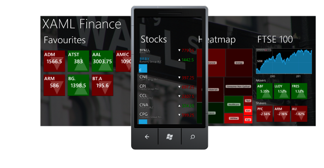
The Windows Phone 7 Panorama control is widely used in applications and to many has come to symbolise the Metro Design Language. Search for panorama images and you will find numerous promo-shots of Windows Phone 7 applications which display the panoramic contents of the application hub, with an image of a phone above it illustrating how the panorama slides through your viewport.
The image below shows a promo-shot for XAMLFinance, an application I have been working on:

Creating images like the one above takes a bit of work, fortunately you can turn off the parallax scrolling effect of the control allowing for easier image stitching, however the process is still quite manual.
For a bit of fun I thought it would be nice to template the Panorama control itself in order to display the full panorama contents on the emulator within a single screen, so that I can create my promo-shot with a single screengrab.
Unfortunately, the Panorama control is a little too tightly coupled to its template to allow this kind of radical re-design, so the next best options is to create a new page that hosts my PanoramaItems within an ItemsControl and style that.
So, we'll start with a page which hosts our items within an ItemsControl:
<ItemsControl Style="{StaticResource ItemsControlStyle}">
    <ItemsControl.Background>
        <ImageBrush ImageSource="PanoramaBackground.jpg" Opacity="0.5"/>
    </ItemsControl.Background>

    <!--Panorama item one-->
    <controls:PanoramaItem Header="item1" Style="{StaticResource PanoramaItemStyle}">
        <Grid>
            ...
        </Grid>
    </controls:PanoramaItem>

    <!--Panorama item two-->
    <controls:PanoramaItem Header="item2"  Style="{StaticResource PanoramaItemStyle}">
        <Grid>
            ...
        </Grid>
    </controls:PanoramaItem>

    <!--Panorama item three-->
    <controls:PanoramaItem Header="item3"  Style="{StaticResource PanoramaItemStyle}">
        <Grid>
            ...
        </Grid>
    </controls:PanoramaItem>
</ItemsControl>
We need to shrink each of those PanoramaItem instances so that they all fit on a single screen. We can easily shrink them with a ScaleTransform, however Silverlight only supports render transforms, what we really need here is a transform that affects layout also (for a brief overview of the difference see this blog post). Fortunately the Silverlight Toolkit has a LayoutTransformer class which emulates this behaviour, and whilst it is not available in the WP7 release, copying the code across I found it to be entirely compatible with the Silverlight WP7 version.
We can shrink our PanoramaItems as follows:
<system:Double x:Key="Scale">0.5</system:Double>

<Style x:Key="PanoramaItemStyle" TargetType="controls:PanoramaItem">
  <Setter Property="Width" Value="260"/>
  <Setter Property="Height" Value="290"/>
  <Setter Property="Template">
    <Setter.Value>
      <ControlTemplate TargetType="controls:PanoramaItem">
        <!-- apply a LayoutTransform to the content in order to scale it -->
        <local:LayoutTransformer>
          <local:LayoutTransformer.LayoutTransform>
            <ScaleTransform ScaleX="{StaticResource Scale}"
                                            ScaleY="{StaticResource Scale}"/>
          </local:LayoutTransformer.LayoutTransform>

          <!-- the original content of the template follows -->
          <Grid Background="{TemplateBinding Background}" Margin="12,0,0,0">
            <Grid.RowDefinitions>
              <RowDefinition Height="auto"/>
              <RowDefinition Height="*"/>
            </Grid.RowDefinitions>
            <ContentControl x:Name="header"
                            ContentTemplate="{TemplateBinding HeaderTemplate}"
                            Content="{TemplateBinding Header}"
                            FontSize="{StaticResource PhoneFontSizeExtraExtraLarge}"
                            FontFamily="{StaticResource PhoneFontFamilySemiLight}"
                            HorizontalAlignment="Left" Margin="10,-2,0,26">
              <ContentControl.RenderTransform>
                <TranslateTransform x:Name="headerTransform"/>
              </ContentControl.RenderTransform>
            </ContentControl>
            <ContentPresenter Content="{TemplateBinding Content}"
                              HorizontalAlignment="{TemplateBinding HorizontalContentAlignment}"
                              Margin="{TemplateBinding Padding}" Grid.Row="1"
                              VerticalAlignment="{TemplateBinding VerticalContentAlignment}"/>
          </Grid>
        </local:LayoutTransformer>
      </ControlTemplate>
    </Setter.Value>
  </Setter>
</Style>
Now we need to styles and template the ItemsControl so that it looks like a Panorama. This is done as follows:
<Style TargetType="ItemsControl" x:Key="ItemsControlStyle">
  <Setter Property="VerticalAlignment" Value="Center"/>
  <Setter Property="HorizontalAlignment" Value="Center"/>
  <Setter Property="ItemsPanel">
    <Setter.Value>
      <ItemsPanelTemplate>
        <tk:WrapPanel Orientation="Horizontal"/>
      </ItemsPanelTemplate>
    </Setter.Value>
  </Setter>
  <Setter Property="Template">
    <Setter.Value>
      <!-- create a template for the ItemControl that makes it look like a panorama-->
      <ControlTemplate>
        <!-- the grid which displays the  panorama background -->
        <Grid Background="{TemplateBinding Background}">
          <Grid.RowDefinitions>
            <RowDefinition Height="auto"/>
            <RowDefinition Height="*"/>
          </Grid.RowDefinitions>

          <!-- the title, scaled to match the PanoramatItems-->
          <local:LayoutTransformer>
            <local:LayoutTransformer.LayoutTransform>
              <ScaleTransform ScaleX="{StaticResource Scale}"
                              ScaleY="{StaticResource Scale}"/>
            </local:LayoutTransformer.LayoutTransform>
            <TextBlock Text="{TemplateBinding Tag}"
                       FontSize="180"
                       FontFamily="{StaticResource PhoneFontFamilySemiLight}"
                       HorizontalAlignment="Left" Margin="10,-2,0,26"/>
          </local:LayoutTransformer>

          <!-- the rendered items -->
          <ItemsPresenter Grid.Row="1"/>
        </Grid>
      </ControlTemplate>
    </Setter.Value>
  </Setter>
</Style>
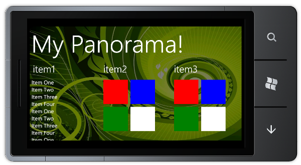
The end result is that we can see the entire panorama contents in a screen-shot ready state:
The big advantage of this approach is that any changes to the application can be reflected in the promo-shot very swiftly. It is also quite good fun having a fully functioning version of your panoramic hub in miniature!
You can download the sourcecode here: PanoramaShot.zip
Regards, Colin E.

