This blog post describes how to implement a conversation / messaging style application with Windows Phone 7. It covers how to style the speech bubbles and the scrolling of the conversation list view when the phone keyboard is shown.
A couple of weeks ago I wrote a blog post which described the creation of a Windows Phone 7 ConversationView, a view which renders a list of messages so that they look like a conversation. In this blog post I am going to extend the concept further, by adding an input text field allowing you to have a conversation with ELIZA, an A.I. chatterbot. This blog post will look at some of the tricky issue regarding scrolling the list of messages so that the most recent is always visible when responding.
You can see a video of this code in action below:
I hoped that I could find a decent C# ELIZA (a classic chatter application that takes on the role of a therapist) implementation on the internet, however, the only one I found was rather basic. If you know of any alternatives, pleas let me know!
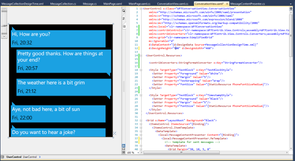
In my previous blog post I created a UserControl which renders each Message instance, where the template used to render the message is dependant on which side of the conversation it relates to. Refer to my previous blog post for implementation details.

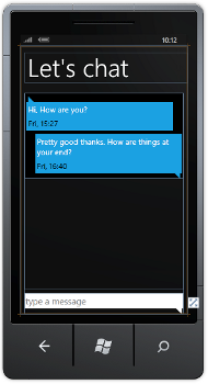
The layout for my simple chat application uses an instance of the ConversationView user control, with a text input located at the bottom of the screen:
<Grid x:Name="ContentPanel" Grid.Row="1" Margin="12,0,12,0">
  <Grid contribControls:GridUtils.RowDefinitions=",Auto">

    <ScrollViewer x:Name="ConversationScrollViewer">
        <!-- conversation view -->
        <local:ConversationView x:Name="conversationView"/>
      </StackPanel>
    </ScrollViewer>

    <!-- the text input field -->
    <Grid Grid.Row="1"
          contribControls:GridUtils.RowDefinitions=",,"
          Margin="0,10,0,0">
      <Rectangle Fill="White"
                  Grid.RowSpan="2"/>
      <txt:WatermarkedTextBox Watermark="type a message"
                              TextWrapping="Wrap"
                              AcceptsReturn="True"
                              Padding="0"
                              x:Name="TextInput"
                              GotFocus="TextInput_GotFocus"
                              LostFocus="TextInput_LostFocus"/>
      <Path Data="m 0,0 l 16,0 l 0,16 l -16,-16"
            Fill="White"
            Margin="0,0,5,0"
            HorizontalAlignment="Right"
            Grid.Row="2"/>
    </Grid>
  </Grid>
</Grid>
Note the simplified Grid markup from the WP7Contrib codeplex project, where the string ",Auto" is used in place of the more verbose RowDefinition XAML elements.

The WatermarkedTextBox is from an article by WindowsPhoneGeek (and it works like a charm - thanks!). A simple Path and Rectangle are added to the layout so that the input field looks like a speech bubble.
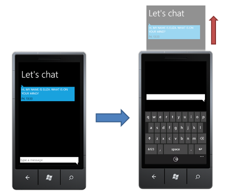
When the user clicks on the input TextBlock the phone keyboard will be revealed, allowing them to enter their message. This is where we stumble upon our first major problem!
When the phone keyboard is displayed, your application content is 'pushed' upwards to make space for the keyboard. Unfortunately, this results in the message which the user is replying to being pushed off the top of the screen ...

Because our ConversationView sits within a ScrollViewer we can scroll to push the message further down the screen, however, this would require a negative scroll offset, which isn't possible!
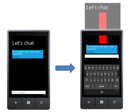
To circumnavigate this issue, we can add an element which is used to 'push' the top message downwards so that it is located at the bottom of the ScrollViewer. The following markup adds a Rectangle which sits above the ConversationView, with two Storyboards that expand / collapse the Rectangle allowing us to push the messages down when we need them:
<ScrollViewer x:Name="ConversationScrollViewer">
  <StackPanel Orientation="Vertical"
              x:Name="ConversationContentContainer"
              VerticalAlignment="Top">
    <!-- padding element -->
    <Rectangle Width="100"
                Height="0"
                x:Name="PaddingRectangle">
      <Rectangle.Resources>
        <Storyboard x:Name="PaddingRectangleShowAnim">
          <DoubleAnimation Storyboard.TargetName="PaddingRectangle"
                Storyboard.TargetProperty="(Height)"
                To="400"  Duration="00:00:00.3"/>
        </Storyboard>
        <Storyboard x:Name="PaddingRectangleHideAnim">
          <DoubleAnimation Storyboard.TargetName="PaddingRectangle"
                Storyboard.TargetProperty="(Height)"
                To="0"  Duration="00:00:00.3"/>
        </Storyboard>
      </Rectangle.Resources>
    </Rectangle>

    <!-- conversation view -->
    <local:ConversationView x:Name="conversationView"/>
  </StackPanel>
</ScrollViewer>
We can detect when the input TextBlock receives focus to determine when the keyboard will be revealed. Using the Show / Hide extension methods I blogged about a while back, we can fire the animations which make this padding rectangle grow or shrink when the keyboard is shown or hidden:
private void TextInput_GotFocus(object sender, RoutedEventArgs e)
{
  PaddingRectangle.Show();
  ApplicationBar.IsVisible = true;
}

private void TextInput_LostFocus(object sender, RoutedEventArgs e)
{
  PaddingRectangle.Hide();
  ApplicationBar.IsVisible = false;
}
If we fill the rectangle so that it is visible, you can see how it pushes down the content as shown below:

The next step is to ensure that the ConversationView is always scrolled so that the most recent message is visible. The ScrollViewer has a ScrollToVerticalOffset method which can be used to programmatically scroll the content, however, because this is not a dependency property it cannot be animated via Storyboard.
Here I am using the same trick I employed for the Windows Phone 7 Jump List control, where a private dependency property that sets the scroll offset value in its change handler is used as a target for the scrolling Storyboard:
/// <summary>
/// VerticalOffset, a private DP used to animate the scrollviewer
/// </summary>
private DependencyProperty VerticalOffsetProperty = DependencyProperty.Register("VerticalOffset",
  typeof(double), typeof(MainPage), new PropertyMetadata(0.0, OnVerticalOffsetChanged));

private static void OnVerticalOffsetChanged(DependencyObject d, DependencyPropertyChangedEventArgs e)
{
  MainPage app = d as MainPage;
  app.OnVerticalOffsetChanged(e);
}

private void OnVerticalOffsetChanged(DependencyPropertyChangedEventArgs e)
{
  ConversationScrollViewer.ScrollToVerticalOffset((double)e.NewValue);
}
Using this dependency property we can create a simple Storyboard and DoubleAnimation that scrolls to reveal the latest message:
private void ScrollConvesationToEnd()
{
  // start from the current position
  scrollViewerScrollToEndAnim.From = ConversationScrollViewer.VerticalOffset;

  // set the scroll position to the the height of the contained content
  scrollViewerScrollToEndAnim.To = ConversationContentContainer.ActualHeight;

  // go!
  scrollViewerStoryboard.Begin();
}
And there you have it, a fully functional conversation application. Enjoy!
You can download the complete sourcecode: WP7ConversationView.zip
Regards, Colin E.
