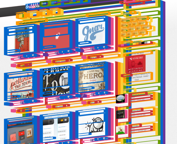
 A little while ago Colin showed me a tool for inspecting the visual tree of a Silverlight/WPF application (Snoop thanks Colin!). The bit I remember was a 3D view of the app, where an element's on-screen depth represented it's depth in the visual tree. I thought it could make a good stress test of -webkit-transfrom performance, so I thought I'd give it a go.
Eye Candy
Let's skip straight to the good stuff! This is a screenshot I captured using the script on the Dribbble homepage -
Give it a go!
If you have a webkit browser (Chrome, Safari, etc.) you can click here to start visualizing this page or drag that link into your bookmarks bar (make sure it's enabled spanner->Bookmarks->Show bookmarks bar) to try it out on any page you fancy. Be warned, using this on a content heavy page (e.g. the BBC News homepage) may well cause your browser to crawl!
Once the script is loaded the position of the mouse controls the rotation of the body and clicking toggles the faces on and off. The transform is centered about the middle of the screen, when the page is scrolled to the top. Therefore you may find the rotation a bit weird if you're scrolled down the page. Refreshing the page is the only way to get back to the original.
How it works
The script works by traversing the DOM tree and assigning each element a constant z-translation. The translations stack because preserve-3d is also set on each element. So the deeper an element is nested the more it will appear to stand out of the screen. A mousemove handler then applies a rotation transform to the body element for navigation, and a mousedown handler takes care of toggling the side-faces.
Webkit 3d transforms don't support depth, they came out of the concept of composite-layers and where depth simply isn't a consideration. In order to get round this, the script creates a div to represent each face and just positions it in the correct 3d location. These divs are generated whilst traversing the DOM which makes it easy to set the correct dimensions on them.
Features
 I think one of the nicest details to come out the visualization is the ability to get a feeling of the underlying implementation without actually having to look at the markup. In this screenshot, taken from a page on ChromeExperiments, the red boxes give away how the developer chose to implement an "n rating/ratings" label.
I also like the effect below on a page from the Surfin' Safari blog which first introduces 3d transforms. The ability to look behind the page is quite novel, especially when you can see the backface of the 3d content already in the page.
This screenshot also introduces one of the many quirks of this script, that of inline elements (in this case green) having very strange side-faces drawn around them. This is happening because the script uses the offsetX/Y/Width/Height attributes to position the side-faces. The wrapping of the inline element then plays havoc with this simplistic approach to measuring.
 Another quirk of the script/3d transforms is how inline elements are positioned along the z-axis. You can see in the below image that the links appear to be at rear of the side-faces, instead of on the front. It seems the the inline content is positioned at the z-position of it's block parent no matter what setting is used (apart from changing it to itself not be inline).
In all the script is a compromise between overriding the site styling to make something pretty looking/usable, and completely breaking the original layout of the website. I think I've struck an alright balance but by all means hack the code on GitHub and submit a PR if you come up with something better.


