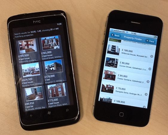
 In this post Colin Eberhardt's Property Finder app gets another outing, but this time with a native twist. Titanium is a popular open-source framework for building multi-platform native apps in JavaScript. Here I've used it to port the existing MVVM application to iOS and Android whilst trying to maintain as much code reuse as possible.
Knockout.js in Titanium?
As a developer, I'm plagued by laziness. In this case it manifested itself such; the original PropertyFinder HTML5 version was written in an MVVM style using Knockout.js, if I adopt an MVVM structure for the Titanium version can I reuse those view-models?
Unfortunately out of the box the answer is no, Knockout.js needs a browser environment to run in and the Titanium runtime obviously doesn't provide one. However, I wasn't about to throw away over 500 lines of perfectly good code without a fight! So I set about tracking down the browser references that Knockout needed. A little bit of trial and error later and out popped the following ugly but functional mock DOM -
var window = (function() {
	return this;
}).call(), document = {
	createElement : function() {
		return {
			getElementsByTagName : function() {
				return [];
			}
		}
	},
	createComment : function() {
		return {
			text : "<!--test-->"
		};
	}
}, navigator = {
	userAgent : ' '
};
This was enough to load Knockout.js and make use of it's subscription and binding functionality, the view-models were now mine! Well not quite, they also made use of some of the jQuery utility methods e.g. $.each for iterating over collections and objects. As jQuery was only being used for it's utility methods, and seeking to avoid a repetition of the fruitful but time-consuming trial and error approach (ref. laziness, first paragraph), I swapped it out for Underscore.js.
Underscore.js is a JavaScript utility library based around the built-in types and helpfully completely unrelated to the DOM. It offers LINQ-esque methods for manipulating collections, type-assertions for all the build-in types and miscellaneous other features. Here's a simple example of $.each versus _.each -
-var $ = require("lib/jquery");
+var _ = require("underscore");
...
- $.each(results.data, function () {
+ _.each(results.data, function(property) {
var viewModel = new PropertyViewModel();
- viewModel.initialize(this);
+ viewModel.initialize(property);
that.properties.push(viewModel);
});
The final step was to remove the AMD wrapper around the modules in order to conform to the CommonJS pattern that Titanium uses. This was a pretty trivial exercise, removing the define module function wrapper and instead of returning the module exports assigning it to module.exports e.g. -
-define("viewModel/ApplicationViewModel", function (require) {
...
function ApplicationViewModel() {
...
}
ApplicationViewModel.Instance = new ApplicationViewModel();
- return ApplicationViewModel;
-});
+module.exports = ApplicationViewModel;
At this point, the view-models would load in Titanium but from a little bit of preliminary prodding seemed have some strange behaviour. After a little bit of debugging I tracked it down to a few instances of type checking which were failing in the Titanium runtime environment. These were quickly fixed using the type-checking utility functions from Underscore.js e.g. -
- if ( typeof(state) !== "object") {
+ if ( !_.isObject(state) ) {
Easy part over, it's time to create the views.
Titanium Itself
I don't want to turn this post into an introduction to building apps with Titanium, there's plenty of them about. Instead I'm going to focus on a few key parts of my experience, what I learnt and how that would change my approach to a similar task next time.
First and foremost, can we map the Property Finder app service requirements onto Titanium features?
- Favourites/recent searches persistence
- localStorage
- Titanium.App.Properties
- Current location
- navigator.geolocation
- Titanium.Geolocation
- Nestoria API access
- XmlHttpRequest
- Titanium.Network.HTTPClient
- Nestoria API parsing
- JSON
- JSON ...
Connecting to these low-level services was probably the easiest part of the whole experience, the APIs are intentionally very similar to their HTML5 equivalents and so the code easily ported across. One shortcut I did come across at this point, which you can use to save yourself some time and delay the onset of RSI, was that the Titanium object is aliased as Ti.
With the bottom service layer done and the view-models copied/pasted, it's time for the UI. Keen to get the job done, I jumped straight into the hello-world example code and started hacking together my first window. Oh how I wish I'd read the introduction to v2.0+ layouts guide (nested deep within the Titanium docs) first. In version 2.0 Appcelerator introduced two layout techniques that make cross platform development much easier -
- The DIPs length unit - Density Independent Pixels allow you to specify a length which the framework will then scale taking into account the DPI of the device.
- Flow layouts - Titatnium.UI.Views can be configured to position their children absolutely or flow them horizontally/vertically. Two magic size values Titanium.UI.Fill or Titanium.UI.Content can then be specified for the control's size which scale it to either fill it's parent or match the size of it's content respectively.
My advice is to read through those links thoroughly because trying to debug layout issues in Titanium can rose tint those memories of debugging layout issues in IE6...
With my new found UI layout knowledge I started making real progress with the views, and happily found that without much effort in the simulator the iPhone screens started looking pretty nice. Encouraged, I decided to try the app out on my Android phone but was surprised to see a Gingerbread-era (read ugly) looking app. A quick Google revealed that all I needed to do was bump the Android SDK version to 14 in order to reference the more modern Ice Cream Sandwich Holo theme.
Disappointed that this wasn't the default setting (the world doesn't need anymore tired looking Android apps!) but satisfied that it was a quick and easy change, the app now at least looked the part. I then went hunting through the API to try and replace the outdated looking title bar with the ActionBar control which was introduced in Honeycomb. Annoyingly 18 months since the release of Honeycomb, the control still isn't available in a released version of the framework. Although the issue has been addressed in version 3.0 of the framework, that itself is not yet released.
Frustrated but undeterred, the next problem I hit was the scrolling performance of the results view. It was poor on iOS and virtually unusable on Android. Thankfully another quick Google revealed a couple of tips for speeding things up -
- Use an ImageView rather than a standard View with a backgroundImage set. This seems to have the effect of background loading the images only when they come into view.
- Set a common className on each of the TableViewRows. This hints to the framework that each row shares a common layout so there is no need for it to layout each row individually.
The performance improved dramatically on both platforms, iOS was now very smooth and Android only occasionally a bit laggy. It was disappointing to see Android performance not up to par with iOS but it was becoming clear that Titanium supports iOS first and Android second (personally I find this a shame being an Android user but I can understand the business rationale).
By this point I had enough of the UI implemented to notice that something was going wrong in the view-models. After a bit of digging I tracked it down to a few instances of type checking which were failing in the Titanium runtime environment. These were quickly fixed using the type-checking utility functions from Underscore.js.
The Final Product
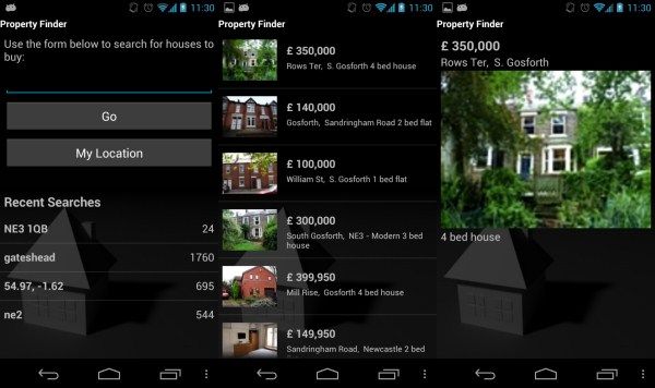
Here are some screenshots captured from my Samsung Galaxy Nexus -

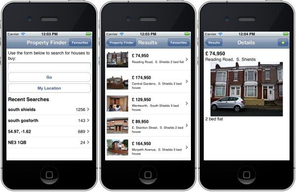
And here's the same app in the iOS Simulator (iPhone non-retina) -

The source code is available on Github as part of the PropertyFinderCrossPlatform project.
The Good, the Bad and the Ugly
The good has got to be the final app, I was genuinely surprised that I could build a native app for both iOS and Android (with very little native experience) in less than a week. The app performs well on both platforms and I think most users would be unable to differentiate it from a "proper" native app. I was able to reuse the vast majority of view-model code from the HTML5 app and managed a reasonable amount of view code-sharing between the two platforms.
The bad is the Titanium API, not for the lack of feature support that I discussed previously, but rather for it's schizophrenic approach to abstraction. It seems completely unable to decide where to draw the line, what to abstract and what to leave as platform specific.
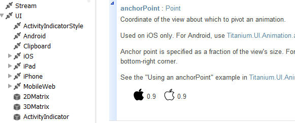
A quick glance at the API suggests a write-once run anywhere approach (well iOS/Android), but a closer look reveals a different story. There are platform-specific packages in the API, even within the common controls certain properties are marked as platform specific and often the documentation pages start with a section explaining how to use a particular control on Android and then a separate section explaining how to use the control on iOS!

I can see how this has happened, as time has gone on the different platforms have evolved in different directions as they seek to differentiate themselves from each other. At the same time a lot of code will have been written against the existing Titanium API so Appcelerator are obviously reluctant to make breaking changes.
However, something needs to change as new code is now being written against an increasingly awkward API, one that's going to struggle with performance as it tries to match old concepts onto new. As such I'd recommend that anyone starting out with Titanium consider it as a set of abstractions of the individual platforms rather than as one overarching abstraction, and therefore plan on producing separate view components for each platform.
With the good and the bad out of the way, it's time for the ugly and boy is it ugly! The mobile web platform support is so much of an afterthought that it's almost a joke. It again suffers from the same platform inconsistencies as iOS/Android (the bad) but then adds a completely different JavaScript runtime environment (pseudo-AMD instead of CommonJS) to the mix. Couple this with a manual build step after each change and I gave up supporting it very quickly.
Don't get me wrong, Titanium is an impressive framework, in breadth even if nothing else. If I were making an app as simple as Property Finder again, I would struggle to find a framework where I could achieve as much code reuse at the same time as such a polished UI. However, I can't help but think it's a step too far away from the native APIs and tooling for me to feel confident using it for any large scale native development.
Your mileage may vary though, so I'd recommend trying it out for yourself.

