As the Edinburgh 2017 Summer Interns, Arran Rashid and I have spent 12 weeks working on a new foyer screen for the Scott Logic offices.
The Project
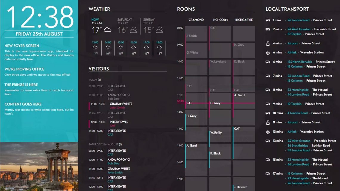
We were tasked with creating a Foyer Screen which would show pertinent information for the office it is in, such as room availability, visitors, local weather, notes, and travel information.
The screen is split into four main columns. The first column contains the current time as well as the notes section. Each offices notes are read from a Google Drive Document, which allows anyone with access to quickly change the message. The server checks in with Google Drive every minute, meaning the data is always accurate. Notes are received in plain text format and then split into each individual note, this is then split into a title and a body.
The second column contains two components as well, weather and visitors. The weather section gathers its data from Dark Sky Api based on the coordinates of the office (which are set in the config). From this, it extracts the required data and passes it onto to the frontend. Visitors gets its data from a set of Exchange Calendars (one for each office) that contain information on all people visiting the office.
The next column shows all room bookings for the current day. It shows three rooms at once and will rotate between them with a transition if there are more than three rooms in the office. The data for this column is pulled from the same calendars that are used for the room booking themselves, meaning that this information is always accurate (within one minute.) As with the other sections, the data from the calendar is parsed to extract the information we require to present it.
The final column contains transport information for each office. This is split into two columns, one for ‘local’ transport (buses, trams, airlink, etc) and one for train links. These two columns are rotated between every 30s, using the same transition from the rooms view. London also has an extra travel component showing the status of all the tube lines. Travel information is retrieved from various APIs, with NRE providing train information for all locations, and location specific APIs giving us data on local transport (buses, etc.)
Below is a screenshot of the finished product:

Deployment
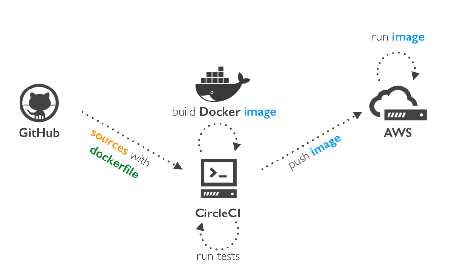
One of the first things we set up was the deployment process for the project. We used Docker to add a layer of abstraction between the application and the operating system. As Docker packages the application and its dependencies into an image, the Docker container can be run on most Linux machines. This made our deployment much simpler than it otherwise would have been as we had CircleCI run our Dockerfile, which built the Docker image. CircleCI then ran a script to deploy the image to Amazon EC2 Container Registry (ECR). AWS ECR has a service running which picked up this incoming image, and (depending on which Git branch the image came from) deployed it to its relevant server - production, develop, or feature.

Backend
Purpose
The backend manages both the web server for the application and the gathering of data from various API’s. The main goal of the backend is to collate data from its various API’s, which it then formats and uses to update the frontend.
We tried to keep the backend as abstracted as possible, using interfaces and resources to keep the main logic away from any API specific implementations.
Technology
This project was written in Typescript and used Node.js. We tried to keep the code structure for the backend organised, with each component having a resource, which collaborates with the DAOs. These DAOs were implementations of an interface, to allow the backend to keep any implementation specific code in one place. This means that if the project wanted to change API’s for any component, it is as simple as writing a new implementation of the DAO interface and swapping the old one out. This also kept testing simple, as we could separate out API specific code from our backend, and replace it for tests.
The nature of the backend meant that we were working with many different API’s, and with each came its own set of challenges. Some of the APIs, such as Dark Sky and TFL, were as simple as making a GET request to their URL’s. Others, such as MS Exchange and Google Drive, were more complex, involving service accounts and authentication certificates.
Challenges
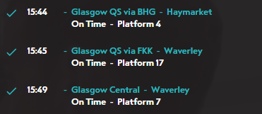
Over the course of the project, there were a number of challenges in getting everything to work together in a stable manner. For example, the Transport section was significantly more complex than the others as it required gathering data from multiple API’s, whereas the other sections only required one. One of the unexpected challenges for Transport was generating the ‘Via’ message for the train, as seen below. Some trains will have their name always showing a station they are going via, for example, “Glasgow Queen Street via Falkirk”. This sounded simple to implement and would make it much clearer which trains to catch but turned out to be slightly more challenging. As the NRE API does not respond with the name that would be displayed in the station, we had to find a way to generate this on our end.

The solution we settled on was to allow the offices to select multiple destinations as part of a route, which our system will then compare against all the trains leaving a given station. If the train matches multiple routes, we then select the route with the broadest definition. For example, a train going to Glasgow that stops at Falkirk will match both the “Glasgow via Falkirk” route and the “Glasgow” route. In this example, “Glasgow via Falkirk” would be the name displayed, as it shows the most descriptive name. Below is an example Route config object.
{
    "id": "GLQvFKK",
    "name": "Glasgow QS via FKK",
    "callingPoints": [
      "FKK",
      "GLQ"
    ]
}
Frontend
Purpose
The main task of the frontend is to display information provided to it by the backend in a way that provides useful, glanceable, information to the user. As such the main challenge in the implementation of the frontend was to create a screen that provided the information to the user in a clear manner. Most of this time this meant following the design spec. However, for some things, such as transport, the UX has evolved as the project developed.
Technology
Like the backend, the frontend was written in TypeScript. It is a React/Redux application that is bundled using Webpack. The only data the frontend generates for itself is the time, all other data comes from the backend. On startup the page performs various GET requests to the backend to collect some initial data. After this, it subscribes to various WebSockets via the STOMP protocol. The code structure of the frontend is compartmentalised, with separation between the process data, presentation components, and the store. This allows for high reusability as, for example, a presentation component can be rendered multiple times with different data.
Challenges
There were a few main challenges that arose during the development of the frontend. Notably the transport columns final design deviated quite heavily from the original spec. Originally transport was a single column that would contain - for Edinburgh - bus, tram, airlink, and train information. The problem we found with this was that the first three items would flood the screen as buses and trams would arrive every couple of minutes. This means that we could only display about 10 minutes of data on the screen. This is quite a big problem when the train station is 15 minutes away. The solution we found to this was to separate trains into their own column. This means that instead of only showing about one train we show the departure times of the trains that we are interested in for about the next hour. This also gave us room to introduce status indicators for trains. Telling the user if a train is on time, delayed, or cancelled. The screen now rotates between these two views on a 30s timer.

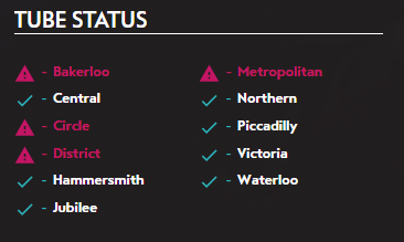
Another challenge that arose as we worked on transport, was that the original design was created specifically for Edinburgh. However, by the time we were working on transport the scope had expanded so that, if they wanted to, any other office could use the screen as well. For London, this proved to be a bit of a challenge as they had different types of public transport that we felt we had to display in a unique way, notably the tube. Eventually, we settled on having a tube status section at the bottom of the transport column that would give a visual indication if something was not operating as expected on one of the lines.
Retrospective
Over the course of the project, both Arran and I learnt many things (Only a few of which we are willing to admit to!). One of the lessons we learnt early on was how important it was to have a plan on how you’re going to solve a problem, rather than trying to improvise on the go. We found that when we took the time to plan we tended to end up with a much more elegant solution, rather than having to do fixes to get around a poorly thought out approach.
If we were to do this project again, we would have placed more of an emphasis on tests. During this project, tests were often written after the actual code for that module had been done, and were a last minute thing to finish off that task. We feel that we would have benefited from having comprehensive, reliable tests during the development of this project, as there were occasional mistakes that slipped past us that could have been caught.
Going Forward
Although we completed all the tasks set out in the project definition, there are a few enhancements we would have liked to have done that we didn’t have time for.
As the project was designed for a specific screen to go in the foyer, the frontend was designed in a static manner, resulting in it responding poorly to screens of other sizes. If we had more time we would have liked to make the web page responsive, so that it could be accessed from any machine without issues.
Another “nice-to-have” feature would be a web page to handle the setup of the config file. Currently, the config is a JSON file containing the required information about the offices, such as location, travel routes, room list ID’s etc. Although we have written documentation to try and simplify the process of amending the config file, having a web page that asks the user simple questions and creates the JSON for them would likely reduce the likelihood of errors.
Finally…
Both Arran and I have greatly enjoyed the challenge of this project, and it has been an invaluable chance to see how projects in the real world differ to those done at University. This was our first time working in an Agile style, and we both enjoyed the flexibility that Sprint planning allowed while still making it clear what tasks needed to be done.
We also benefited from the valuable opportunity to work with patient, experienced developers whose code reviews were immensely helpful in showing us the correct way of doing things. As a result of this, we are now more confident developers and better placed to succeed in our future careers.

