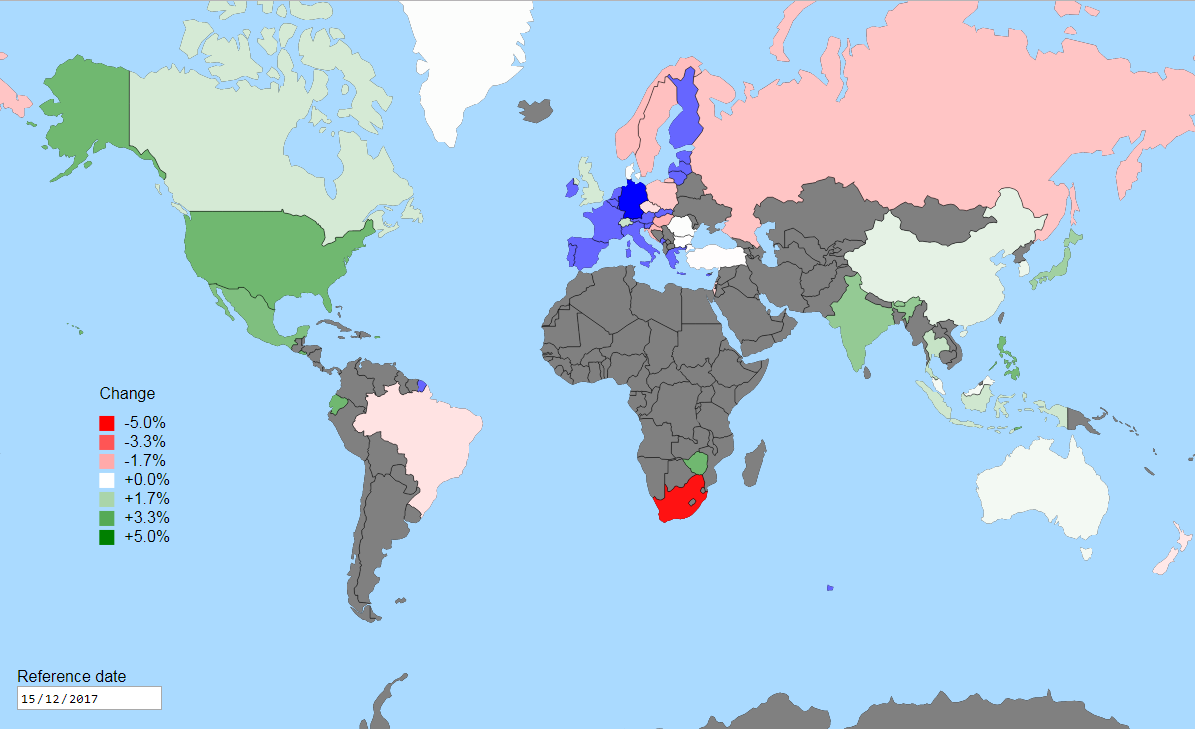
In this post, I’ll describe how I used D3 and free currency exchange data to create an interactive map of relative changes in currency strength. The end result is an interactive world map where you can select your base country and reference (past) date, to view which countries’ currencies have strengthened or weakened since that date.

If you want to try it out, it’s available on the D3 Blocks website.
World map data
Vector map data from Natural Earth can be rendered to a 2-dimensional map using D3’s geographic projection microlibrary (d3-geo). Datasets for many types of physical and political world structures is available, but for this example all I’m interested in is countries. Conveniently, this is available on GitHub already converted to the efficient TopoJSON format. The TopoJSON Client library is used to convert this to the GeoJSON format which is understood by many libraries, including d3-geo:
function prepareGeoData(world) {
  const land = topojson.feature(world, world.objects.land);
  const countries = topojson.feature(world, world.objects.countries).features;
  const borders = topojson.mesh(world, world.objects.countries, (a, b) => a !== b);

  return { land, countries, borders };
}
In addition to extracting the land and countries, I’m extracting the borders between countries as a mesh and filtering them to include shared borders only once.
Rendering the world
Now we have our data, it’s time to render it onto a 2-dimensional SVG map. This requires a projection to be used, since we’re rendering the surface of a sphere (the world) onto a flat surface. I’m going to use the commonly used Mercator projection, which is included in d3-geo along with many others. Before we can use it, it needs configuring for our needs:
const projection = d3.geoMercator()
  .scale(width / (2 * Math.PI))
  .clipExtent([[0, 0], [width, height]])
  .translate([width / 2, height / 2])
  .center([0, 10]);
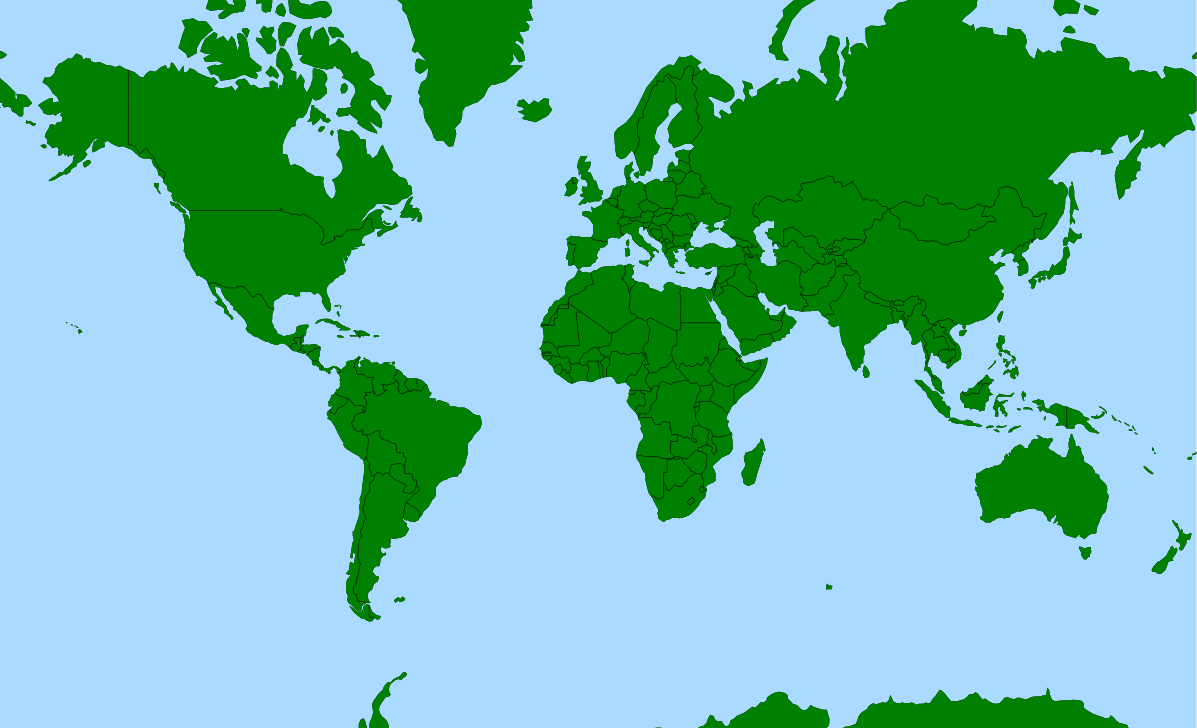
I’m going to stick mostly with Mercator’s original configuration by using an aspect ratio of 1.65, and truncating the map at 80° North and 66° South. This gives us a rectangular map (the projection projects to a square) focused on our area of interest by truncating some of the Arctic and much of the Antarctic. To do this, I’ll set the aspect ratio (elsewhere using CSS), provide a scaling function to fit the current width, clip to the size of the element, translate the projection center to be in the centre of the element, and shift down the projection center by 10° (to compensate for the truncation at North).
The projection is then given to the geographical path generator, which generates path instructions (coordinates) for an SVG <path> element’s d attribute (here, to render the land):
const pathGenerator = d3.geoPath(projection);

svg.append('path')
  .datum(land)
  .enter()
  .classed('land', true)
  .attr('d', pathGenerator);
The generator is used similarly to generate the background of the world (i.e. the sea), using .datum({ type: 'Sphere' }), and individual countries and their borders using data joins against our countries and borders data.

Sourcing currency data
I used the free Fixer API for currency data, which sources its data from the European Central Bank. Historical data is available back to 1998, but many of the less significant currencies aren’t included.
Given a date and a base currency, the API returns a simple map of the rates:
GET https://api.fixer.io/2000-01-03?base=EUR HTTP/1.1{
"base": "EUR",
"date": "2000-01-03",
"rates": {
"CHF": 1.6043,
...
}
}We’ll need to make two requests to this API - one for the reference (past) date, and one for the latest date. Using the rates from each date, we’ll calculate the percentage change for each country’s currency, and store it on the country’s geo object.
Since the map deals with countries while we want to show currencies, we need a mapping from country code to currency code - I used this one. The map uses ISO 3611-1 numeric codes, while the mapping uses the two-character alpha codes, so I also needed to use this mapping between those two. Ideally, I’d preprocess the map data to add these codes offline rather than doing the association at runtime.
Due the limited set of currencies reported by Fixer, I also integrated with the currencylayer API - this has many more currencies which results in a lot less grey “no data” area on the map. However, the free tier has a fairly low monthly quota and doesn’t support HTTPS - so I made it opt-in.
Colouring the countries
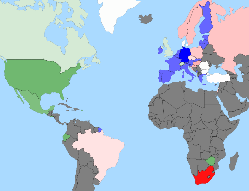
Countries are coloured on a linear scale from red (base has weakened against) to white (no change) to green (base has strengthened against). The sentiment perspective is therefore that of a buyer in the base currency (e.g. an importer), given the positive/negative connotations of green/red. To do this, we use a linear scale with a central pivot at zero (white):
const colorScale = d3.scaleLinear()
  .range(['red', 'white', 'green']);
To match the range, we need to set a domain - which will determine what amount of percentage change will map to the colours at the ends of the scale. A fixed domain (e.g. -20% to +20%) would allow for easy comparisons between different dates, but would be less useful when changes are in a much larger (likely over long time periods) or much smaller range (likely over short time periods). Therefore, I used a dynamic domain based on the extent of change for the current data being shown.
Choosing a strategy for determining the domain proved to be quite fiddly, especially when including volatile currencies (many are included in currencylayer). I settled on a symmetric nice()‘d domain, calculated from the current data by ignoring extreme values and constraining large ones:
const extremum = determineScaleExtremum(countries);
colorScale.domain([-extremum, 0, extremum]).nice();

function determineScaleExtremum() {
  // (simplified to remove logging)

  d3.max(countries, country => {
    const absChange = Math.abs(country.properties.rates.change);

    if (absChange > 1) {
      // extreme; ignore
    } else if (absChange > 0.3) {
      // large; constrain
      return 0.3;
    } else {
      return absChange;
    }
  });
}
Since the scale isn’t clamped, the colour for off-scale values will be extrapolated by D3 and will tend towards black. The scale is used to set the fill of each country:
.attr('fill', d => colorScale(country.properties.rates.change)));We now have a coloured map, but there are a few cases which are better coloured differently: the base country, countries which have the same currency as the base country, and countries for which we don’t have data. To do this, we wrap the scale in a method to deal with each case (the template method countryCharacteristic is used to extract the conditionals; this is also used to set informative tooltips on each country):
function countryColor(country) {
  return countryCharacteristic(country, {
    base: () => 'hsl(240, 100%, 50%)',
    sameCurrencyAsBase: () => 'hsl(240, 100%, 70%)',
    ratesPresent: rates => colorScale(rates.change),
    ratesMissing: () => 'gray'
  });
}
Interactivity - changing the base country and reference date
Allowing the base country to be changed is quite straightforward - a click handler is added to each rendered country, which re-fetches currency data with that country’s currency as the base currency. Changing the reference (past) date is done similarly - a native HTML date picker is used, which triggers a data fetch using the selected reference date.
Once the new data in either case has been received, it’s a case of updating the data on the countries’ geo objects, recalculating the colour scale, re-binding the data using D3 and letting the update() selections update the necessary attributes of our elements.
Other libraries
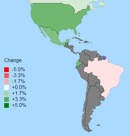
The legend uses the D3 SVG Legend component. So that the zero pivot (white) is included, it needs to be configured using an odd number of cells. It’s positioned using the projection function to be out of the way in the Pacific ocean.

I’m using two D3FC components to simplify a few things. The custom elements make it easier to re-render when the size of the element changes, and the data join wrapper removes much of boilerplate that tends to occur with enter/append/update. Both are available as standalone microlibraries. You can read more about the motivation behind them in these two posts.
D3 pattern: single-element data join
When the base country or reference date has changed, various elements’ attributes need to be updated. The common data join usage handles this great when we want many elements, for example countries:
const countriesUpdate = svg.selectAll('path.country')
  .data(countries)
// ...
But there are also cases where we only where we only want a single element, while still having a selection with correct enter & update - this was the case for the <title> element inside each country’s <path>. I was introduced to the following pattern which I found useful - doing a data join using a data wrapping function:
countriesUpdate.selectAll('title')
  .data(d => [d]);
The country’s data object is pushed down by selectAll(), but we then provide a data key function that just wraps the country’s data in an array. The data join will unwrap this and give us a single element selection bound to the original country data object. The element will be in either the enter or update selection, as appropriate.
(The actual implementation is much more concise than the above, thanks to the use of D3FC’s data join component).
Visualising world events & the long term
Using the map, we can visualise the impact of specific world events on the currencies involved, as well as long-term changes. Here are a few examples, including deep links to the map with the noted base country and reference date. Note that all change % is against today’s rate, and comparison is made by switching the reference date between before and after each event.
- 2014 largest single-day drop for the Ruble (Russia, 15 Dec 2014 vs. following day)
- 2015 abandonment of Swiss franc - Euro cap (Switzerland, 14 Jan 2015 vs. following day)
- 2016 UK EU membership referendum (United Kingdom, 23 June 2016 vs. following day)
- This decade (2010s) to-date for some major world currencies: US Dollar, Euro, Japanese yen, Pound Sterling, Swiss franc, Renminbi (China)
The end result
The map can be viewed here on bl.ocks.org.
You’ll need a browser that supports ES6 features.
To see data for more countries, use currencylayer as the data source - see instructions in the readme on the Blocks page.


