When it comes to creating complex bespoke charts, of all the JavaScript visualisation / charting frameworks, D3 is the clear winner. This blog post takes a step-by-step look at the process of of building an ‘advanced’ financial charting using D3, with additional components from d3fc.
D3 is a highly versatile toolkit for creating charts and visualisations, however, it’s API is quite low level, with a vocabulary that focusses on paths, rectangles, groups and other primitives. There are many charting frameworks that are built using D3, making it much easier to create conventional charts, but in doing-so the underlying power of D3 is lost - I’ve discussed this issue in more detail in a previous post “Unboxing D3”.
With d3fc we’ve taken a fundamentally different approach, extending the D3 vocabulary, allowing you work with series, annotations and gridlines directly, but without losing the underlying power of D3. If you’d like to read more about this thought process, I’d recommend my previous article, “Extending D3 with higher-order components”.
Anyhow, that’s enough of the theory - this blog post shows how to build a chart step-by-step. Less theory, more practice!
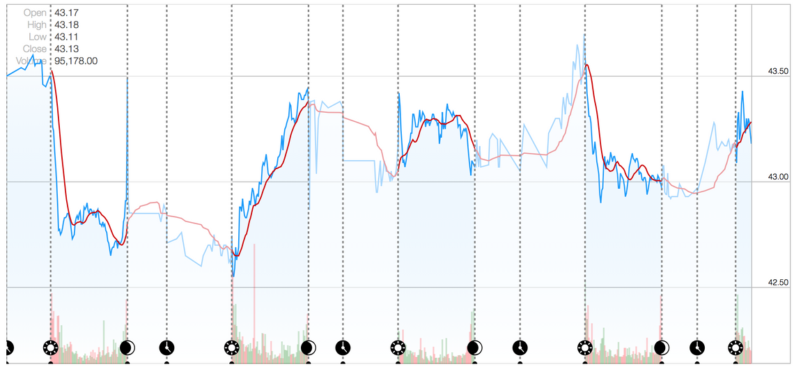
The chart this post will re-create is from Yahoo Finance:
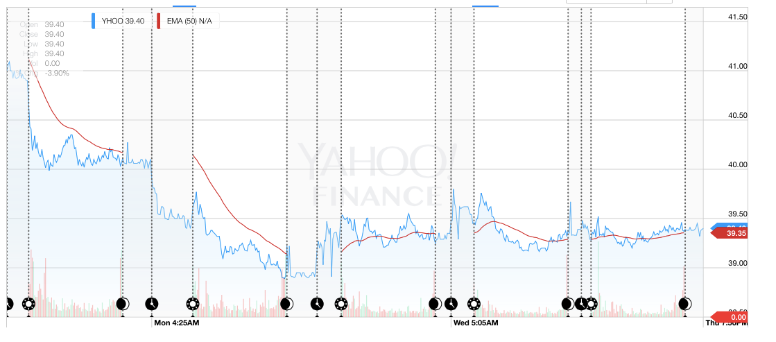
(Please note, since grabbing that screenshot Yahoo have actually replaced the chart with something much simpler)
If you want to take a sneaky peak at the end result, pop over to GitHub and take a look
Rendering a simple chart
Let’s get started with rendering a very simple chart…
The data for this chart is in CSV format, which can be loaded using the new D3v5 request API, which supports promises. The following code loads the data and performs some basic transforms:
const loadDataEndOfDay = d3.csv("/yahoo.csv", d => ({
  date: new Date(d.Timestamp * 1000),
  volume: Number(d.volume),
  high: Number(d.high),
  low: Number(d.low),
  open: Number(d.open),
  close: Number(d.close)
}));

loadDataEndOfDay.then(data => {
  // render the chart here
});
We need an HTML element for rendering the chart:
<div id="chart-element" style="height: 500px"></div>
Once the data is loaded, we use a small number of d3fc components to render the data:
const xExtent = fc.extentDate()
  .accessors([d => d.date]);
const yExtent = fc.extentLinear()
  .pad([0.1, 0.1])
  .accessors([d => d.high, d => d.low]);

const lineSeries = fc
  .seriesSvgLine()
  .mainValue(d => d.high)
  .crossValue(d => d.date);

const chart = fc
  .chartCartesian(d3.scaleTime(), d3.scaleLinear())
  .yOrient("right")
  .yDomain(yExtent(data))
  .xDomain(xExtent(data))
  .svgPlotArea(lineSeries);

d3.select("#chart-element")
  .datum(data)
  .call(chart);
Which gives the following:
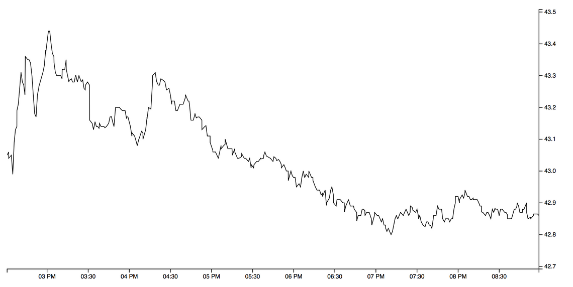
The above coded uses the d3fc extent, line series and chart components. I’ll briefly describe each of them:
The extent component is similar in function to D3’s extent function, which calculates the maximum and minimum of an array. This is used to compute the domain (i.e. visible range) for the chart. The d3fc extent component allows you to specify padding, ensure symmetry, include specific values and various other useful feature - for more information, consult the API docs.
The line series component renders an SVG line, with the mainValue / crossValue properties defining accessors on the underlying data.
Finally, the chart component creates a chart, which is comprised of two axes, and a plot area. The line series is associated with the chart by supplying it as the plot area. The chart also supports rendering of Canvas components, such as seriesCanvasLine. The chart is responsive, if the size of the element changes it will automatically re-render.
These components all use the standard D3 component convention as described by Mike Bostock, allowing them to be rendered using D3 data joins. As you can see, they are all independent, which means you can use each of them on your own, combined with other D3 code, should you wish.
Area fill
Where other charting libraries might represent line, point and area as a single series type, d3fc prefers a ‘micro component’ approach where each are separate. For this chart an additional area series component is required to provide the subtle gradient fill effect:
const areaSeries = fc
  .seriesSvgArea()
  .baseValue(d => yExtent(data)[0])
  .mainValue(d => d.high)
  .crossValue(d => d.date);
Notice that the baseValue accessor is set to a constant value which is the minimum y-value. This ensures that the gradient fill extends across the visible range of values, rather than extending down (and being stretched) to zero.
Gridlines are another d3fc component:
const gridlines = fc
  .annotationSvgGridline()
  .yTicks(5)
  .xTicks(0);
The chart plot area only accepts a single series, however multiple series instances can be grouped together using a multi-series:
const multi = fc.seriesSvgMulti()
  .series([gridlines, areaSeries, lineSeries]);

const chart = fc
  // ...
  .svgPlotArea(multi);
One implementation detail that is not immediately obvious here is that all d3fc series components expose xScale and yScale properties which are set by the chart when a component is added to the plot area. The multi series takes care of passing the scales onto each of the sub-series.
With this in place, the chart now looks a bit more colourful:
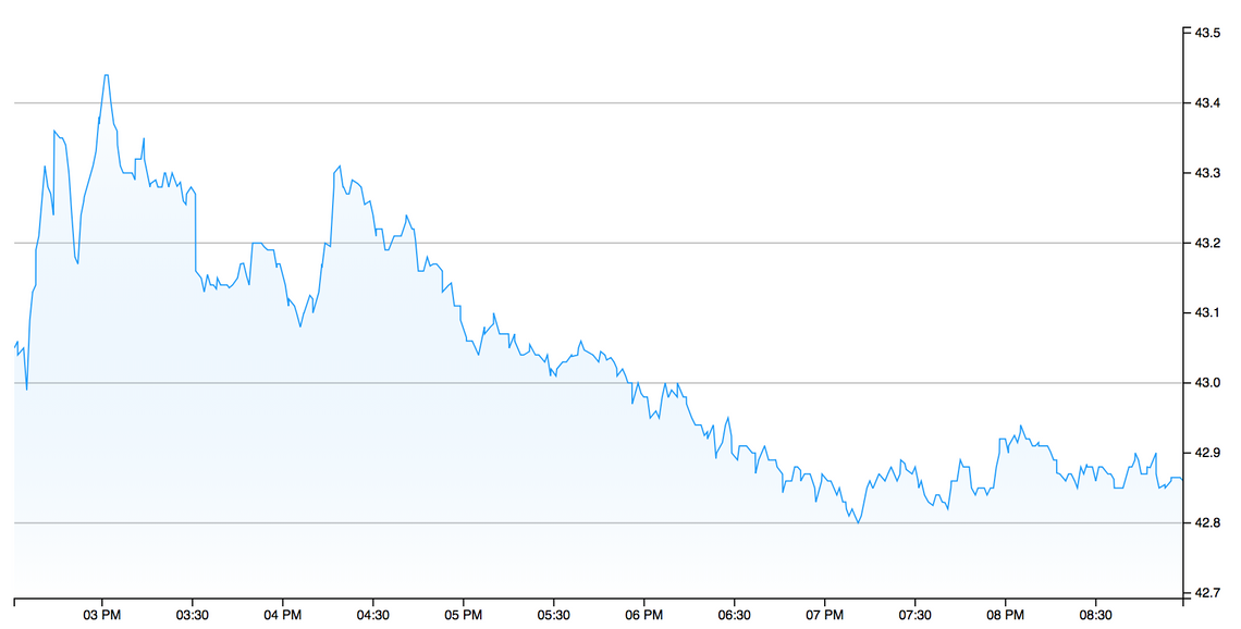
The gradient itself is applied by CSS.
Adding a moving average
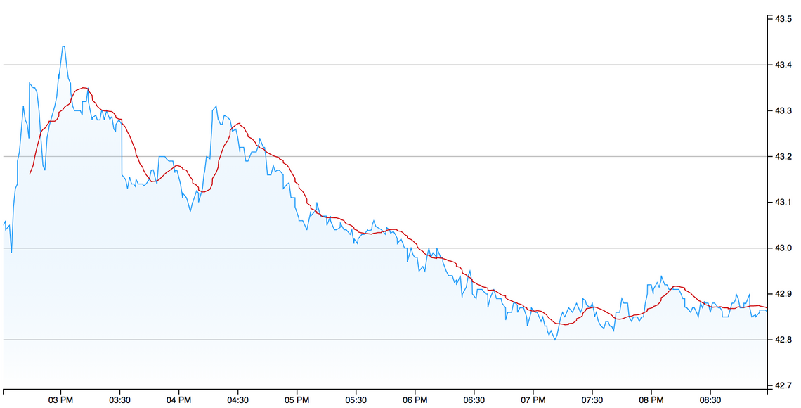
The red line in the Yahoo chart is a Moving Average, which creates an average value based on the previous ‘n’ datapoints, smoothing the underlying data. d3fc has a number of financial indicator components, one of which is a simple moving average.
The following creates a moving average component instance, which computes based on the ‘high’ value, with a period of 15 (i.e. each point in the output data is the result of averaging the previous 15 values).
Invoking the component instance with the chart data returns the moving average:
const ma = fc
  .indicatorMovingAverage()
  .value(d => d.high)
  .period(15);

const maData = ma(data);
D3 data joins operate on a single array of data, so the easiest way to add the moving average to the chart is to merge it into the current series. The following uses the an object spread to clone each data point, adding the moving average value:
data = data.map((d, i) => ({ ma: maData[i], ...d }));
D3 enforces a clean separation between data and its visual representation, d3fc follows this same approach. In order to render the moving average, we just need to add another series to the chart:
const movingAverageSeries = fc
  .seriesSvgLine()
  .mainValue(d => d.ma)
  .crossValue(d => d.date)
  .decorate(sel =>
    sel.enter()
      .classed("ma", true)
  );
The above series is added to the chart via the multi-series component shown above.
You might be wondering what that funny decorate method is all about? This is one of the key features of d3fc - the decorate method exposes the underlying data join that the component uses to render itself. This means that you can use the full power of D3 to manipulate the component. In this example we are simply adding a class via the enter selection, but you can do much more interesting and powerful things with decoration!
With the moving average in place the chart is starting to look a bit more interesting:
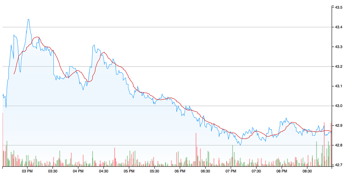
Adding a volume series
The Yahoo chart which we are recreating renders the traded volume of the stock as a bar chart, with the bars coloured green when the price is rising in that period, and red when it is falling. The way that this series is rendered is a little interesting, the volume series is rendered in the same area as the main price series, but only occupies the bottom third of the chart. Furthermore, it does not have a visible axis.
You can use the decorate pattern described above to add additional plot areas to the chart (which I’ll show you how to do later), however, for the volume series there’s a simpler trick that can be applied!
D3 scales are a versatile concept, allowing you to map from one domain to another. A simple way to add the volume series is to map the volume domain onto the price domain so that it can be rendered using the same scale. This is surprisingly simple.
The first step is to create an extent component so that we know the range of volume values:
const volumeExtent = fc
  .extentLinear()
  .include([0])
  .pad([0, 2])
  .accessors([d => d.volume]);
const volumeDomain = volumeExtent(data);
The use of include ensures that the returned extent includes zero, while the padding of [0, 2] will pad the extent to ensure the volume series is pushed down to the bottom third of the chart.
The real ‘magic’ happens next, with the following scale mapping the volume domain onto the price domain:
const volumeToPriceScale = d3
  .scaleLinear()
  .domain(volumeDomain)
  .range(yExtent(data));
The following bar series component renders the volume data, using the above scale within the mainValue accessor:
const volumeSeries = fc
  .seriesSvgBar()
  .bandwidth(2)
  .crossValue(d => d.date)
  .mainValue(d => volumeToPriceScale(d.volume))
  .decorate(sel =>
    sel
      .enter()
      .classed("volume", true)
      .attr("fill", d => (d.open > d.close ? "red" : "green"))
  );
In this case the decorate function provides the selection (data join) that renders each individual bar as an SVG path. The attr function is used to adjust the colour based on whether the price is rising or falling, a great illustration of the decorate pattern in action!
Adding the volume series to the multi-series gives the following chart:
Adding a legend
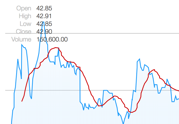
The legend for this chart is a simple little table that shows the open, high, low, close and volume values for the last datapoint within the chart. This information is quite easy to render using a simple D3 data-join, which is why we haven’t added a legend component to d3fc - it would yield very little value.
It is still worth wrapping up the component functionality into a component for the sake of clarity (and potential re-use).
Here’s a very simple legend component that expects an input array of objects with name and value properties:
const legend = () => {
  const labelJoin = fc.dataJoin("text", "legend-label");
  const valueJoin = fc.dataJoin("text", "legend-value");

  const instance = selection => {
    selection.each((data, selectionIndex, nodes) => {
      labelJoin(d3.select(nodes[selectionIndex]), data)
        .attr("transform", (_, i) => "translate(50, " + (i + 1) * 15 + ")")
        .text(d => d.name);

      valueJoin(d3.select(nodes[selectionIndex]), data)
        .attr("transform", (_, i) => "translate(60, " + (i + 1) * 15 + ")")
        .text(d => d.value);
    });
  };

  return instance;
};
You’ll notice that the above code doesn’t use the classic D3 data join pattern, instead it uses the d3fc data join component to create the SVG text elements. Rather than having to explicitly manage the enter, update and exit selections, this components allows you to express that you want a text component for each datum, which is uniquely identified by a legend-label CSS class. For a much more in-depth look at the features of this component I’d recommend reading “Building Components with D3 Data Join” by Chris Price.
The following code takes a single datapoint and turns it into an array of name / value pairs which are suitable for rendering with the above component:
const dateFormat = d3.timeFormat("%a %H:%M%p");
const priceFormat = d3.format(",.2f");
const legendData = datum => [
  { name: "Open", value: priceFormat(datum.open) },
  { name: "High", value: priceFormat(datum.high) },
  { name: "Low", value: priceFormat(datum.low) },
  { name: "Close", value: priceFormat(datum.close) },
  { name: "Volume", value: priceFormat(datum.volume) }
];
The final step is to add the legend to the chart, and yes … you’ve guessed it … we use the decorate pattern once again:
const chart = fc
  .chartCartesian(d3.scaleTime(), d3.scaleLinear())
  // ...
  .decorate(sel => {
    sel
      .datum(legendData(data[data.length - 1]))
      .append("svg")
      .style("grid-column", 3)
      .style("grid-row", 3)
      .classed("legend", true)
      .call(chartLegend);
  });
The above uses the decorate selection to bind the legend data to the current selection, via datum. The chart component uses CSS grid layout, with the above code adding a new SVG element in the third row and column, which is where the plot area is located. Finally, the legend component is rendered via the selection’s call method:
There are some other simple styling changes that are required to match the original chart, involving extending the axis ticks, adding a border, and offsetting the axis labels. These are all pretty straightforward changes, which I’m not going to detail here. It’s time to dive into a much more interesting topic!
Trading hours and discontinuous axes
The current chart renders just a few hours of trading data - when this is extended to include data for a number of days, the chart starts to look pretty odd:
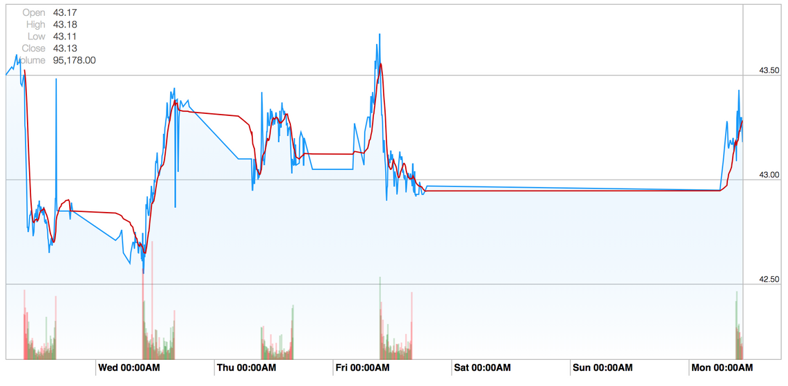
There are a couple of things going on here; the first is that stocks are traded on exchanges that have opening hours, in this case the New York Stock Exchange which operates from 09:30 - 16:00, which is when the greatest volume of traders occur. The second is a small amount of after-hours trading, these are typically low volume but do result in the price moving.
There is little value in rendering the periods of time when the price isn’t changing, which is why financial charts often use a ‘discontinuous’ axis, i.e. an axis which has a number of ‘breaks’.
d3fc has a discontinuous scale component which allows you to adapt a scale, adding the required gaps or breaks. The following is a very simple example which creates a linear scale with a gap in the ranges 50 - 75 and 100 - 125:
var scale = fc.scaleDiscontinuous(d3.scaleLinear())
  .discontinuityProvider(fc.discontinuityRange([50, 75], [100, 125]));
The discontinuity provider interface also allows the creating of recurring discontinuities, for example charts that skip every weekend, however, for our purposes a discontinuity based on a number of discrete ranges is sufficient.
The first thing we need to do is determine the time of the first and last trade within each day for our data. The following function does the trick:
const tradingHours = dates => {
  const getDateKey = date =>
    date.getMonth() + "-" + date.getDate() + "-" + date.getFullYear();

  const tradingHours = dates.reduce((acc, curr) => {
    const dateKey = getDateKey(curr);
    if (!acc.hasOwnProperty(dateKey)) {
      acc[dateKey] = [curr, curr];
    } else {
      acc[dateKey][1] = curr;
    }
    return acc;
  }, {});

  return Object.keys(tradingHours).map(d => tradingHours[d]);
};
The above function gives the trading hours for each day, the D3 pairs function is used to ‘pair up’ the close from one day with the open of the next, giving the required discontinuities:
const xScale = fc.scaleDiscontinuous(d3.scaleTime());

const tradingHoursArray = tradingHours(data.map(d => d.date));
const discontinuities = d3
  .pairs(tradingHoursArray)
  .map(d => [d[0][1], d[1][0]]);

xScale.discontinuityProvider(fc.discontinuityRange(...discontinuities));
This has the desired effect, closing the gaps:
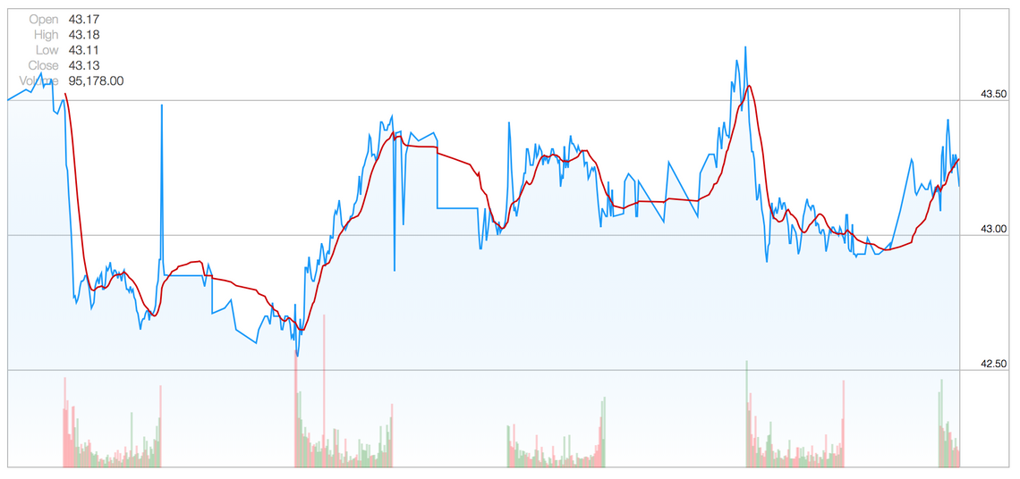
One interesting side effect is that our x axis ticks have vanished, this is because the underlying D3 scale decided to add tick marks at midnight for each day, which falls within our discontinuities.
This is easily rectified by setting explicit tick intervals:
// create a tick at 9:30 for each day
const xTicks = d3.timeMinute
  .every(30)
  .filter(d => d.getHours() === 9 && d.getMinutes() === 30);

const chart = fc
  .chartCartesian(xScale, yScale)
  // ...
  .xTicks(xTicks)
Annotations
The original chart has some interesting annotations, a combination of vertical lines and bands, to make the out-of-hours trading clearer. d3fc has a number of different annotation types that can be used to render this sort of feature.
Here we make use of the band and line annotation:
const verticalAnnotation = fc
  .annotationSvgLine()
  .orient("vertical")
  .value(d => d.value)
  .decorate(sel => {
    sel
      .enter()
      .select(".bottom-handle")
      .append("use")
      .attr("transform", "translate(0, -20)")
      .attr("xlink:href", d => d.type);
    sel
      .enter()
      .select(".bottom-handle")
      .append("circle")
      .attr("r", 3);
  });

const bands = fc
  .annotationSvgBand()
  .orient("vertical")
  .fromValue(d => d[0][1])
  .toValue(d => d[1][0]);
Notice that the vertical line annotation has a number of additional elements added via the decorate pattern, giving the little circular clock icons.
These annotations are not bound to the main time series data, instead that render the discontinuities. So how do we provide this data to them?
The first step is to add the required data as a property of the array which the chart renders:
data.tradingHoursArray = tradingHoursArray;
The annotations are added via the multi-series component, which has a useful mapping function that can be used to map the bound data for specific components, in this case transforming the data for these two annotations:
const multi = fc
  .seriesSvgMulti()
  .series([
    gridlines,
    areaSeries,
    lineSeries,
    movingAverageSeries,
    volumeSeries,
    bands,
    verticalAnnotation
  ])
  .mapping((data, index, series) => {
    switch (series[index]) {
      case verticalAnnotation:
        return flatten(data.tradingHoursArray.map(markersForDay));
      case bands:
        return d3.pairs(
          data.tradingHoursArray.map(d => exchangeOpeningHours(d[0]))
        );
      default:
        return data;
    }
  });
These additional annotations result in the following chart:
Crosshairs
For the final step, we’ll add a bit of interactivity to the chart, a cross hair the tracks the cursor position. In order to implement this, we need to handle mouse / pointer events on the chart’s plot area. d3fc has a very simple pointer component that handles mouse events, emitting the cursors x and y position as events.
To make use of this, the chart code needs restructuring a little, allowing it to be re-rendered as events are handled. Here are the required changes:
const render = () => {
  d3.select("#chart-element")
    .datum(data)
    .call(chart);

  const pointer = fc.pointer().on("point", event => {
    data.crosshair = event.map(({x}) => {
      const closestIndex = d3.bisector(d => d.date)
        .left(chartData, xScale.invert(x));
      return data[closestIndex];
    });
    render();
  });

  d3.select("#chart-element .plot-area").call(pointer);
};

render();
The render function allows the entire chart to be re-rendered.
The above code handles the point event, using the cursors x position to find the closest data point, using a D3 bisector. The closest point is added to the crosshair property of the data that the chart renders. The final step is to add component to render this data, in this case the d3fc crosshair component.
Rather than showing a screenshot, it’s best to see this feature in action, so why not pop over to GitHub to see the finished chart?
Summary
D3 is incredibly powerful, you really can create anything you like with it. Our hope is that d3fc, when combined with D3, will allow you to rapidly build complex charts, without losing the power that D3 provides.
This example is quite bespoke and complex chart, which we’ve been able to match, pretty much pixel-for-pixel, with only a couple of hundred lines of code.
Not bad eh?
If you’re creating a chart, why not give d3fc a go?.

