D3 is a popular and widely used library for creating bespoke visualisation. It has a relatively low-level API, allowing you to create a highly diverse range of data-driven graphics based on SVG elements and canvas. Our goal with D3FC is to make it easier to create conventional charts (i.e. cartesian charts), by extending the D3 vocabulary to include series, annotations and of course charts themselves.
Recently we’ve been looking at enhancing the D3 axis component to implement a number of common features including more flexible label placement (e.g. positioning labels between ticks) and rotation / offset of labels to avoid collisions. This blog post demonstrates some of these features and how they were implemented.
The D3 axis
The D3 axis component is one of the more complex visual components within the D3 library, the other visual D3 components tend to be quite low-level (paths, chords, polygons, shapes). The axis component provides a visual representation of its associated scale, with the scale itself performing the underlying logic of mapping between coordinate systems (e.g. from input domain to pixels on the screen).
The D3 axis API is quite simple, beyond setting the the number of ticks and length of tick lines themselves, there is little else you can modify. Interestingly the API docs have the following to say:
The elements created by the axis are considered part of its public API.
Therefore, if the axis doesn’t allow a given customisation, the recommended approach is to modify the DOM elements after the axis has been rendered - a technique called post selection.
With D3FC we decided to create a drop-in replacement for the D3 axis, with a more flexible API that makes it easier to customise the appearance (without the need for post selection), and includes common features such as the ability to center axis labels, and rotate labels if they collide.
The decorate pattern
One of the most powerful features of D3 is the data join, where DOM elements are constructed via data-binding. Furthermore, the general update pattern allows you to define exactly how these data-bound elements are modified as items are added, remove or updated.
Unfortunately the D3 component pattern, where reusable units are encapsulated as functions, also encapsulates the data-join, hiding its power. The D3 axis component uses a data-join internally, but as a consumer of this component you cannot add extra logic to the enter selection. The decorate pattern addresses this issue, by allowing the construction of components in such a way that their internal data-join is ‘exposed’.
Components that implement this pattern have a decorate property that exposes their underlying data-join. Here’s an example that demonstrates this feature of the D3FC axis. The enter selection is modified to set the fill colour of the tick labels:
const scale = d3.scaleLinear()
  .domain([0, 140])
  .range([0, 400])
  .nice();

const axis = fc.axisBottom(scale)
  .decorate((s) =>
    s.enter()
      .select('text')
      .style('fill', d >= 100 ? 'red' : 'black');
  );
Here’s how that axis would look:

While this makes it easier to modify the appearance of the axis component, without the need for post selection, it is still quite a low-level tool.
We looked at some common axis visual customisations and added them to the API directly.
Centered labels
A common question among D3 users is “how do I center axis labels?”. Before looking at the implementation of this feature, it’s worth asking why people want this feature? It turns out there are actually a couple of different reasons, which has informed our implementation and API design.
Centering labels with a linear scale
Continuous scales map a continuous range of values (the input domain) to an output range. When rendered via a D3 axis, the ticks and their associated labels represent specific instances within this continuous domain. For example, a linear scale might have ticks and labels rendered at 0, 20, 40, 60, 80, 100 as illustrated below:

This makes perfect sense - the ticks represent a specific instance or point on the linear scale.
However, in some circumstances the axis labels might relate to a range of values rather than a specific instance. Considering another type of continuous scale, the time scale, in the following example the labels indicate the days of a week. In this case the labels refer to a range of values on the underlying continuous time scale:

In this case, it makes much more sense to render the labels in between the ticks. The D3FC axis has a tickCenterLabel property which, when set to true renders the labels in between ticks:
const timeScale = d3.scaleTime()
  .domain([new Date('2019-03-04'), new Date('2019-03-09')])
  .range([margin, width - margin]);

const axis = fc.axisBottom(timeScale)
    .tickArguments([5])
    .tickCenterLabel(true);
This gives the following axis rendering, which makes more sense:

Although, please note, this style of rendering isn’t universally applicable to time scales. It entirely depends on the nature of your labels. If, in the above example, the labels included a time component, e.g. “Mon 04, 12:00”, they would no longer relate to a range of values.
Ordinal axis with a band scale
There is another quite different reason why you might want to render axis labels in-between ticks, and that is when using band scales.
Band scales are a type of ordinal scale (where the domain is composed of a set of values rather than a continuous range) used for rendering bar or column charts. To illustrate, here is how you would create a simple band scale and render it using the D3 axis:
const vegetableScale = d3.scaleBand()
  .domain(['Carrots', 'Bananas', 'Sausages', 'Pickles'])
  .paddingInner(0.1)
  .paddingOuter(0.1)
  .range([margin, width - margin]);

const axis = d3.axisBottom(vegetableScale);

// ...
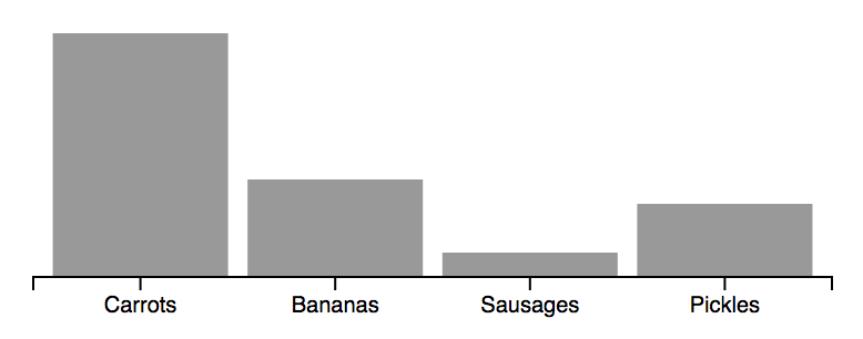
The resulting chart (with the code for rendering the columns themselves omitted), would look like the following:

We once again meet the same problem, the axis labels relate to a ‘band’ rather than an instance on a continuous scale. However, in this case the label is in the logical location, and it is the ticks that should be moved.
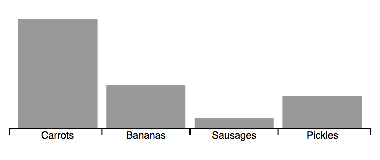
D3FC has a specific axis type for rendering ordinal scales. It is a simple change to swap the D3 axis for the D3FC ordinal equivalent
const axis = fc.axisOrdinalBottom(vegetableScale);
Which results in the following:

In both cases the D3FC axis is a drop-in replacement for the D3 axis, supporting the same API.
Label rotation / offset
A very common problem when rendering charts is how to handle axes that have an excessive number of labels? For continuous scales the solution is often quite straightforward, render fewer ticks! But for ordinal data (for example, countries of the world), omitting some of the ticks or labels will likely make your chart unreadable.
Most off-the-shelf charting solutions, including those built into products like Excel, will use strategies to avoid overlapping labels. They might rotate, or offset them if there is not enough space for rendering.
With the decorate pattern you have the opportunity to implement this behaviour yourself, however, it is relatively complex, which is why we decided to add components that provide this functionality to D3FC directly.
Our API favours composition, allowing us to keep the API-surface small and concise. Rather than add this functionality direct to the axis component, it is introduced via an adapter.
Here’s an example that applies the axisLabelRotate adapter to an ordinal axis. Notice that the adapter exposes all of the underlying axis properties, so you can still adjust properties of the ticks etc …
const axis = fc.axisLabelRotate(fc.axisOrdinalBottom(foodScale))
  .tickSize(4)
  .tickPadding(6)
With this adapter in place, the axis determines whether labels will collide and rotates them accordingly. We’ve added another adapter axisLabelOffset that performs a similar function but in this case offsets rather than rotates labels.
Here’s an interactive example that shows both adapters in action:
Other D3FC updates
As well as these recent additions to our axis component, we’ve been making other enhancements elsewhere within D3FC.
The chart component brings together a pair of axes, a canvas or SVG plot area, using CSS grid layout to create the basic structure required for a cartesian chart. Now that we have more than one axis component, we’ve introduced a new way to create chartCartesian(...), giving it a settings object as a parameter instead of xScale/yScale. The settings object lets you specify the components to use for each axis. Here’s an example:
Now that there are lots of different ways to render the axis components, we need a way to adjust how much space is given to them. chartCartesian lets us do this via the new xAxisHeight and yAxisWidth properties.
Conclusion
Our goal with D3FC is not to replace D3, rather, it is to enhance it with additional components that make it easier to create charts and visualisations. Hopefully these new additions to our axis component will be useful to you when creating your own charts.
If you’ve got additional ideas or challenges you are facing, feel free to share the via our GitHub issues page.


